Overwatch Champions Series unveils two tracks ahead of 2024 finals
Overwatch Champions Series
Image credit: ESL FACEIT Group

The Overwatch Champions Series (OWCS) has released two themed tracks ahead of its inaugural season finals later this month.

The two instrumental songs, titled Anthem and Overtime, are available on YouTube and were created by Dutch composer Justin Welgraven. The songs will be used at different points during the OWCS Finals broadcast.

The Overwatch Champions Series 2024 Finals is set to commence on November 22nd during DreamHack Stockholm, a notable gaming and esports festival owned by ESL FACEIT Group. The Overwatch Champions Series is operated by ESL FACEIT Group and is the successor to the Overwatch League following its closure in 2023.

Interestingly this is not the first time that ESL FACEIT Group has utilised music to bolster the identity of a tournament. In 2022, when the company was ESL Gaming, it launched a ‘sonic identity’ and an official anthem that is used throughout its events and content. Similarly, the Overwatch theme songs were created to be used in competitive Overwatch and become recognisable to fans and viewers.

The first track, called Anthem, is the hero track for the tournament series and will be played after a team wins the round, as well as during other important events in the league. It is a more majestic song, with lots of strings and orchestral segments that are similar to Overwatch’s existing in-game music.

The second track, called Overtime, is a more modern take on the main theme, with more electronic elements that, according to an interview in Rolling Stone, works well when commentary is laid out on top of it. As such, it is expected that the Overtime song will likely be played during post-match segments, for example.

Ivan Šimić

Ivan comes from Croatia, loves weird simulator games, and is terrible at playing anything else. Spent 5 years writing about tech and esports in Croatia, and is now doing it here.

OWCS World Finals announces crowdfunding bundle
Image credit: Blizzard (via X)

The upcoming Overwatch Champions Series World Finals has launched an in-game crowdfunding bundle that will contribute directly to its prize pool.

The bundle, called the Neon Streets Mega Bundle, will feature skins inspired by Overwatch League 2023 champion Florida Mayhem.

The World Finals is the season-ending event in the inaugural season of the OWCS, the new Overwatch league operated by the ESL FACEIT Group after the dissolution of the Overwatch League. The idea of crowdfunding the prize pools was first explored during the OWCS Dallas Major earlier this year.

The prize pool for the event will be increased through the sales of the Neon Streets Collection, a set of three separate bundles that can themselves be bundled into a Mega Collection. These include skins for heroes Mei, Tracer and Junkrat, as well as weapon skins, charms, emotes, name tags and sprays. The bundles range in price between 1600 and 2200 OW Coins, and the Mega Bundle costs 3,000 coins. 25% of the sales will go directly to the prize pool of the event.

For comparison, a pack of 1,000 coins usually costs around £10, $10 and 10 through the Blizzard store. Design-wise, the items are based around Florida Mayhem’s victory at the 2023 Overwatch League Championship.

To help boost viewership, the event’s Twitch and YouTube streams will hand out drops for viewers who spend at least one hour watching. These drops will be exclusive to the streams and will change each day of the event.

The World Finals will feature eight of the best Overwatch teams, including former Overwatch League teams Toronto Defiant and NRG Shock. The event will take place in Stockholm, Sweden, as a part of the DreamHack Stockholm from November 22nd to the 24th..

Ivan Šimić

Ivan comes from Croatia, loves weird simulator games, and is terrible at playing anything else. Spent 5 years writing about tech and esports in Croatia, and is now doing it here.

Quadrant shifts away from esports, departs Halo scene
Image credit: Quadrant

British esports organisation Quadrant has announced via a statement on social media that it will no longer participate in the Halo Championship Series, Halo’s top-flight esports league.

The company will also shift its overall focus away from competitive esports to angle itself more towards fashion, content and motorsport in the future.

Quadrant is a UK-based esports and lifestyle brand that was founded by Formula 1 driver Lando Norris, who currently drives for McLaren. The brand has since gone on to position itself at the intersection of esports, fashion and popular culture, leveraging the fanbase of its founder and the interest in esports and gaming.

The company’s esports efforts were mostly tied to Halo, where the team competed in the Halo Championship Series. Whilst the team had mixed competitive success in the HCS, the organisation has the accolade of hosting the first-ever Halo Infinite Major in Europe, which took place in London this May.

Quadrant also competed in Rocket League via a partnership with Veloce Esports, but its team disbanded in 2023. In addition to competitive rosters, the company has several content creators in various games, including Warzone.

Ever since its inception, Quadrant was more aligned towards merchandise, motorsport and gaming in general than esports. However, now the company has decided to completely shift from esports towards these other segments.

In an exert of the statement shared via social media, Quadrant said: “As of today, Quadrant announces that we are departing the Halo Championship Series and wider direct involvement in esports to continue with full focus on the mission of being a brand rooted at the intersection of motorsport culture, fashion and creative content.”

Interestingly, The company received a seven-figure investment earlier this year to help facilitate Quadrant’s growth. The investment also welcomed William Jonathan Lenney, known as WillNE, as a Co-Owner.

Ivan Šimić

Ivan comes from Croatia, loves weird simulator games, and is terrible at playing anything else. Spent 5 years writing about tech and esports in Croatia, and is now doing it here.

ESL FACEIT Group announces ESL Saudi Challenge
Image of ESL Saudi Challenge logo on the background of Saudi Arabian city
Image credit: ESL FACEIT Group

Esports tournament organiser ESL FACEIT Group has announced the launch of the ESL Saudi Challenge, a tournament series open exclusively to gamers located in Saudi Arabia.

The inaugural tournament will see players from the country compete in Overwatch 2.

The tournament takes place from October 18th and runs until December 7th with open qualifications and a playoff phase. The grand finals will take place at Riyadh-based gaming venue VOV Gaming. In addition, the tournament will feature a $20,000 (~£15,301) prize pool.

The ESL Saudi Challenge is the first time an ESL-branded tournament has taken place in Saudi Arabia. The tournament acts as an opportunity for local talent to showcase their skills ‘on a global stage’ with viewers from across the world tuning into the action.

Saudi Arabia has become a hotbed of activity for the esports industry throughout 2024. In August, the Saudi Esports Federation and MOONTON Games signed an MoU to grow the industry in the country. The same month Korean esports organisation Gen.G announced plans to open a dedicated hub in Riyadh.

ESL FACEIT Group remains one of the largest esports tournament organisers in the world. In October, it appointed Esports Engine Co-founder Adam Apicella as its Senior Vice President of Esports for North America.

Franck Guignery, Senior Vice President of Middle East and Africa at ESL FACEIT Group, spoke on the news: “The ESL Saudi Challenge is more than just a tournament—it’s the beginning of a new chapter for esports in Saudi Arabia.

“Whether you’re an aspiring esports player, a professional  player or a fan, this is your chance to be part of the action and witness the rise of local talent.”

Jonno Nicholson

Jonno is a Freelance News Writer for Esports Insider and has been part of the ESI team since 2019! His interests include the rapid rise of sim racing and its impact on the wider industry.

Riyadh Season named Twisted Minds main sponsor 
Twisted Minds
Image credit: Twisted Minds

Saudi Arabian esports organisation Twisted Minds has announced winter entertainment festival Riyadh Season as its main sponsor.

Few details have been revealed surrounding the deal, however, the organisation mentioned via LinkedIn that further information would be revealed soon.

Founded in 2021, Twisted Minds competes in a variety of titles such as Rocket League, PUBG Mobile and EA FC. The organisation’s biggest success comes from Overwatch, with Twisted Minds winning the Overwatch Champions Series 2024 — EMEA Stage 1. 

Launched in 2019 by Saudi Arabia’s General Entertainment Authority, Riyadh Season is a large-scale festival that includes a range of entertainment and sporting events in the country’s capital of Riyadh. 

The festival is no stranger to securing sponsorships, with Riyadh Season also partnering with Spanish football league La Liga and sports streaming platform DAZN earlier this month. 

Riyadh Season joins Twisted Minds’ commercial portfolio, which also includes the likes of VOV Gaming, Steelseries and Alrajhi Bank, among others. 

Riyadh Season’s sponsorship of a local esports organisation comes amid a major push by the Saudi Arabian government into esports and gaming in recent years. Earlier this year Saudi Arabia hosted the Esports World Cup, an annual multi-title esports event that, similarly to Riyadh Season, is part of the country’s Vision 2030 strategy. 

Tom Daniels

Tom has been part of Esports Insider's team since October 2020 and is currently the platform's Editor. When not playing Football Manager, he enjoys reporting on the mobile esports scene as well as the betting sector.

Halo World Championship 2024 breaks 100,000 peak viewers
Image of Halo and Halo World Championship 2024 logos with a trophy on blue and red background
Image credit: Halo

The Halo World Championship 2024 became the 10th most-watched Halo esports event in the game’s franchise.

The season-ending Halo Championship Series (HCS) tournament featured 16 teams from across the world competing for a share of its $1m (~£762,785) prize pool.

According to esports data platform Esports Charts, the 2024 Halo World Championship recorded peak viewing figures of 101,818, with an average of 48,547 viewers across its 24-hour airtime.

Based on peak viewership, the most popular Halo event remains 2021’s HCS Kickoff Major which took place in Raleigh, North Carolina. The event tops the charts with a peak viewership of 267,279.

This year’s event was won by North American esports organisation Spacestation Gaming, with its Halo team claiming $400,000 (~£305,158) in prize money after defeating OpTic Gaming in the Grand Finals. The 2024 HCS season saw a total of four Major tournaments take place across North America and London.

In comparison to the 2023 Halo World Championship, 2024 has seen a slight decline in viewership. Peak viewership dropped by approximately 36.2% (159,000) while average viewing figures decreased by 34.8% (74,468). Last year’s world finals was the second most watched Halo esports event ever.

Moreover, this year’s World Championship did record slightly fewer peak viewers than the Halo Championship Series 2024: Arlington Major (109,670).

Following the conclusion of the 2024 Halo World Championship, the HCS revealed Halo’s esports circuit will be returning for 2025 with a $1m (~£762,785) prize pool for the World Championship. Details on event locations and the partnered teams have yet to be revealed.

Despite a decline in viewership, Halo remains one of the more popular arena shooters on the market.

Jonno Nicholson

Jonno is a Freelance News Writer for Esports Insider and has been part of the ESI team since 2019! His interests include the rapid rise of sim racing and its impact on the wider industry.

‘Dragon Quest Monsters: The Dark Prince’ iOS Review – Much Better Than Switch, but Lacking in Two Ways

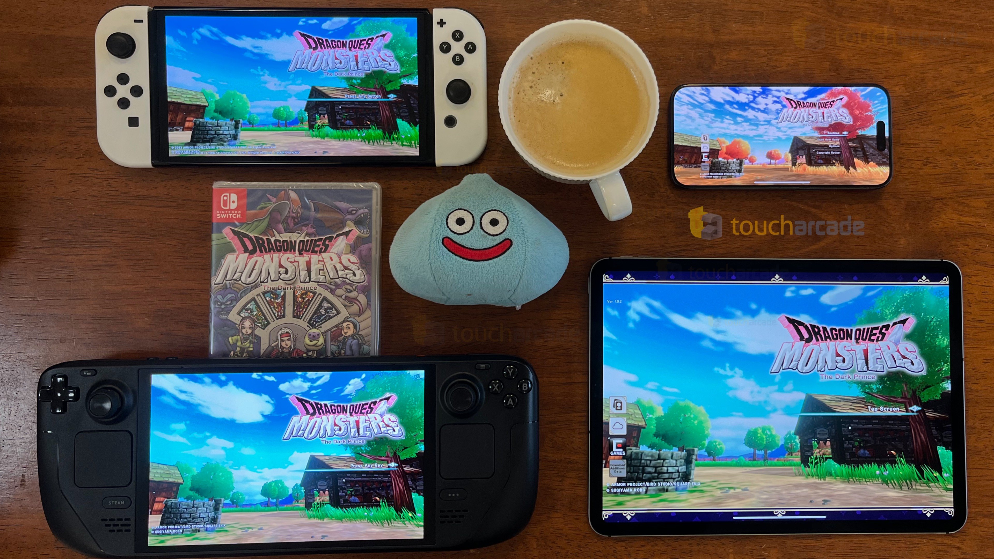
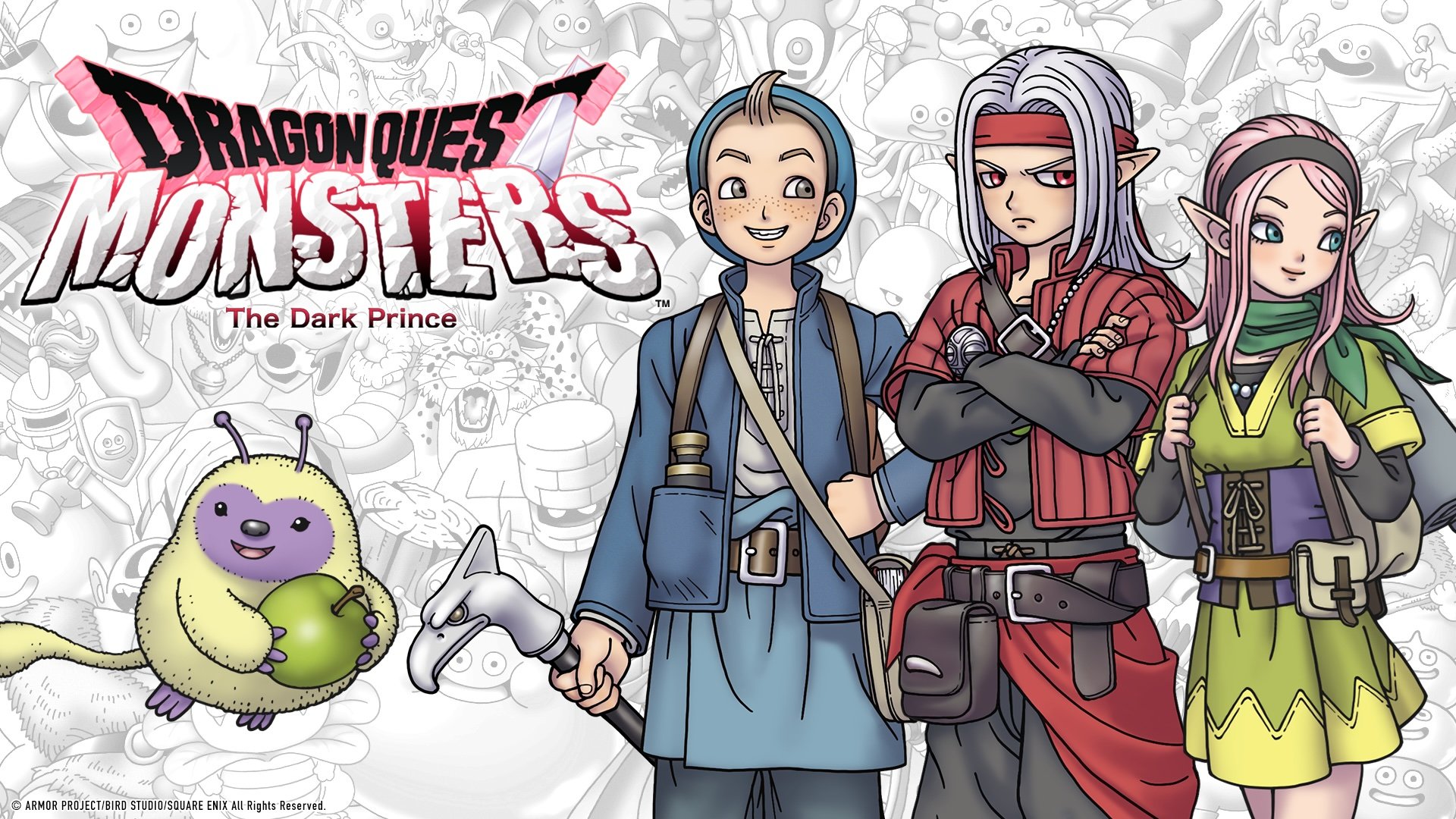
Back in December, I reviewed Square Enix’s monster collecting RPG Dragon Quest Monsters: The Dark Prince on Switch. I loved my time with it despite its many technical issues. I expected it to hit PC like Dragon Quest Treasures, another Nintendo Switch exclusive, but I didn’t expect a mobile release. Square Enix’s newest release of Dragon Quest Monsters: The Dark Prince on iOS, Android, and Steam brings all prior paid DLC into the game at a lower entry point, but removes one feature. This is the online real-time multiplayer battles. Beyond that, Dragon Quest Monsters: The Dark Prince on Steam and mobile is already a massively better experience just on value with its lower price point and the content included, but is the game worth your time in this crowded release period and with its premium price? That’s what I aim to answer with my Dragon Quest Monsters: The Dark Prince mobile review also covering the game on Steam Deck.

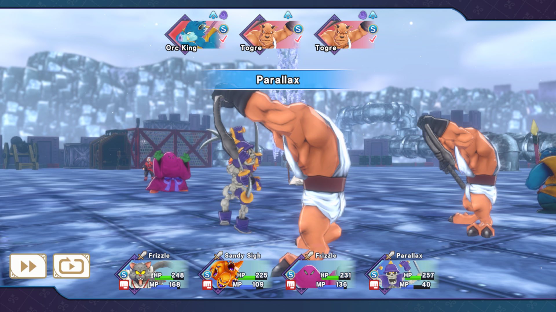
If you aren’t familiar with Dragon Quest Monsters itself, it is a spin-off series of the main Dragon Quest games featuring turn-based combat, but instead of the main player fighting, you capture, breed, and raise monsters to fight for you. When I played Dragon Quest Treasures, I enjoyed it, but was told that it is a “Monsters-lite” game so when Dragon Quest Monsters: The Dark Prince was announced for Switch, I was excited to play it. I ended up loving it as you can see from my review linked above, but I think it is a very strong monster collecting RPG with turn-based combat regardless of if you like Dragon Quest or not. What made Dragon Quest Monsters: The Dark Prince more interesting, is in how it feels like a side story and prequel to Dragon Quest IV. Dragon Quest Monsters: The Dark Prince also had a seasonal feature where the monsters changed depending on the season and area you’re in.

When it comes to the story, Dragon Quest Monsters: The Dark Prince, the bits from IV already made it more interesting than the usual spin-off, but I found myself focusing more on getting my own dream monster party rather than worrying about the narrative. I’m super pleased with how well thought out the mechanics are and how the large zones, hundreds of monsters, and combat made me want to keep playing it more even on Switch when I first beat it let alone now on iPhone, iPad, and Steam Deck. Beyond the normal turn-based battles and recruiting new monsters, Synthesis in Dragon Quest Monsters: The Dark Prince is like Shin Megami Tensei’s fusion, and there is just so much you can do with skills here. The seasons here don’t just change monsters, but also areas you can explore with map changes. This means a water body that you can’t cross will be frozen in one season letting you access a new secret.

Combat in games like this can get monotonous so I’m glad to see the many quality of life features here like the tactics menu that plays out similar to the original Persona 3, direct commands, and more. You aren’t here to just defeat enemies, but also scout them to bring to your party and become stronger. I didn’t end up testing the online multiplayer on Switch much, so I can’t comment on how big a loss that is here, but it is a game mode being cut nonetheless. If you did play it on Switch, keep that in mind as it is the only area the mobile and Steam versions are lacking compared to Switch.

Dragon Quest Monsters: The Dark Prince already shipped with a lot of content, but the DLC only elevated the experience. This DLC was sold in the Digital Deluxe Edition or as standalone DLC for the base game. Just the DLC was over $25 on Switch, so having the full base game with all DLC included for $24 on mobile makes it an amazing deal, but I’ll get to that in a bit. This DLC included The Mole Hole, Coach Joe’s Dungeon Gym, and Treasure Trunks. The Mole Hole was a dungeon that lets you scout (recruit) monsters you’ve fought before and it made min-maxing a lot easier during the game. The DLC was also good to speed things up since you could also easily scout monsters who only appear during a specific season or through synthesis.

The Coach Joe’s Dungeon Gym DLC has randomly generated maps and they are meant to be postgame challenges rather than experienced while playing the game. The final DLC is just a chest that can be opened once an hour with 10 items in total. This is like a cheat DLC if you may. I didn’t think it was good to have useful game modes or content in paid DLC, but that isn’t a problem anymore with all of it included on iOS, Androidl, and Steam in the base asking price.

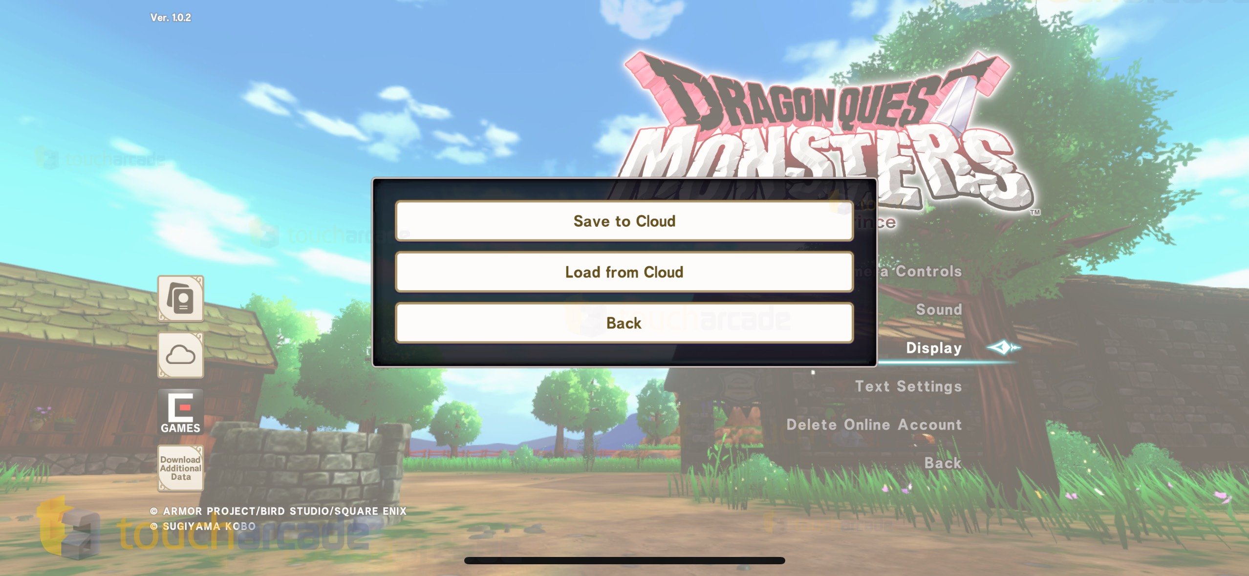
Now let’s get to the mobile port features. With Square Enix, you can never be sure what features will make it into the final game. Dragon Quest Monsters: The Dark Prince does not have controller support. This is beyond disappointing since the game is literally a console title ported to mobile. I tried 6 different controllers without any luck to be sure. Aside from controller support, Dragon Quest Monsters: The Dark Prince on iOS has cloud saves and a few graphics options. The cloud saves work well.

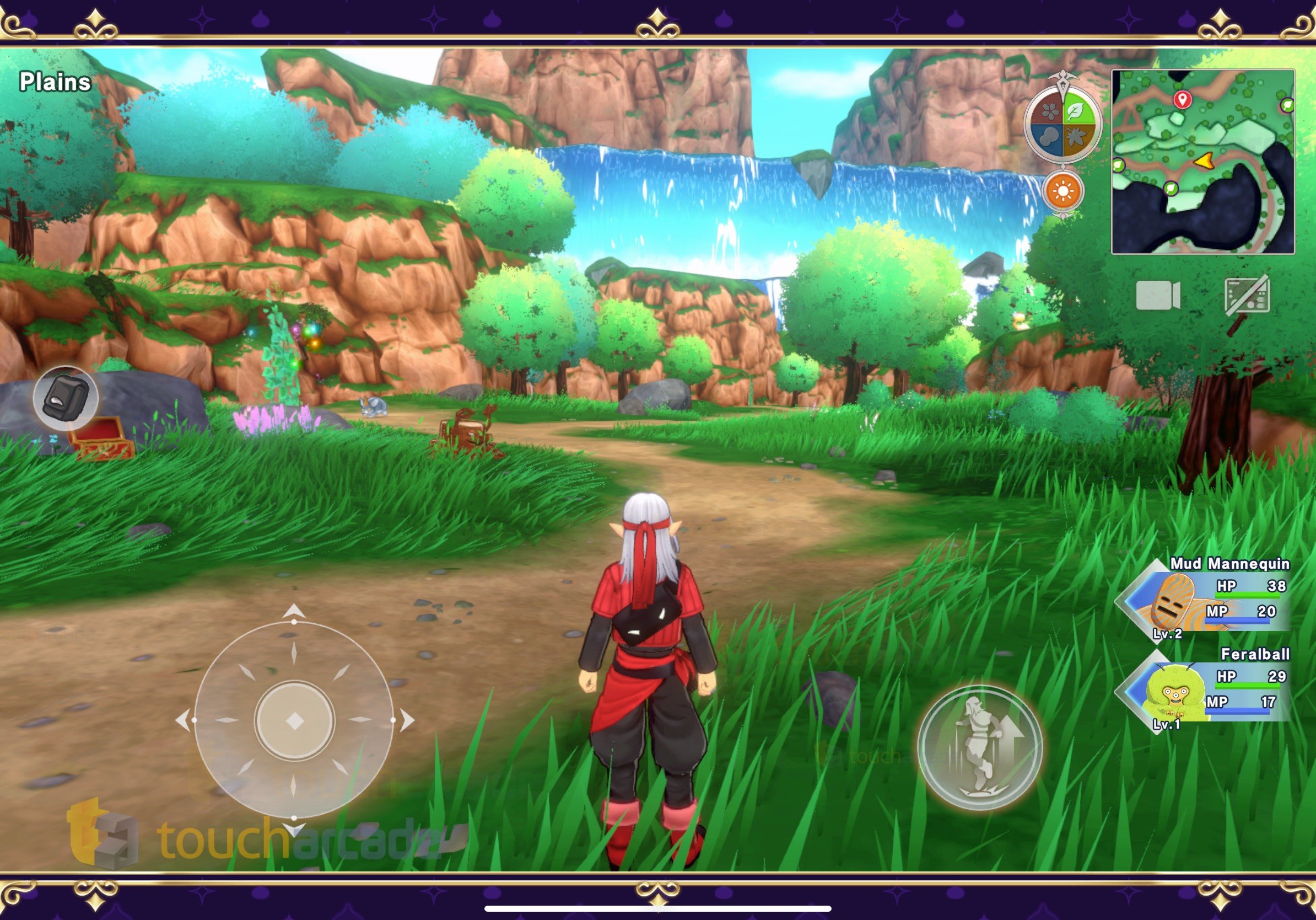
When it comes to controls, I was surprised at how well Dragon Quest Monsters: The Dark Prince felt with touch controls. It uses a floating joystick on the left for movement and a jump button mainly while exploring. The one minor issue you might run into is some touch targets being a bit small on the non Plus/Max phones. These aren’t an issue on iPads at all though. The controls feel good, but Square Enix should’ve left full controller support in since this is a console game ported to mobile after all.

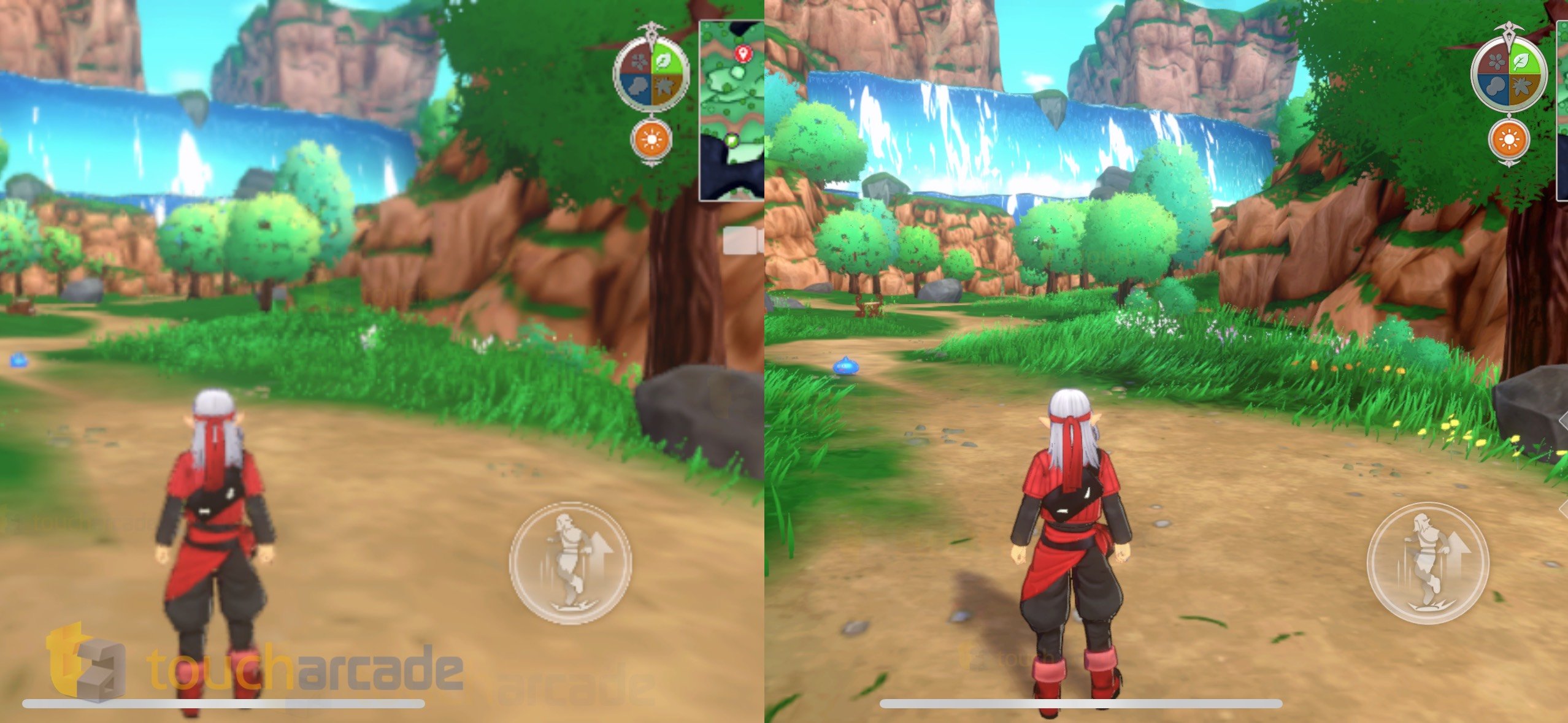
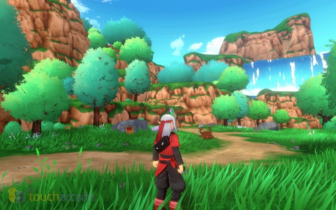
One of my only real issues with Dragon Quest Monsters: The Dark Prince on Switch was on the technical side. The frame rate was rough at launch with visuals not being great either. The former got addressed to some degree unlike Pokemon Scarlet & Violet, but the latter never got fixed. On iPhone 15 Pro, iPhone 12, and even iPad Pro, I had no major issues with the visuals or performance. There are some hiccups on iPhone 15 Pro when running at the highest graphics quality setting and moving through some locations, but it isn’t remotely as bad as on Switch. The game feels massively better to play on iOS. Check out the comparison below for the low and high graphics options on iPhone 15 Pro:

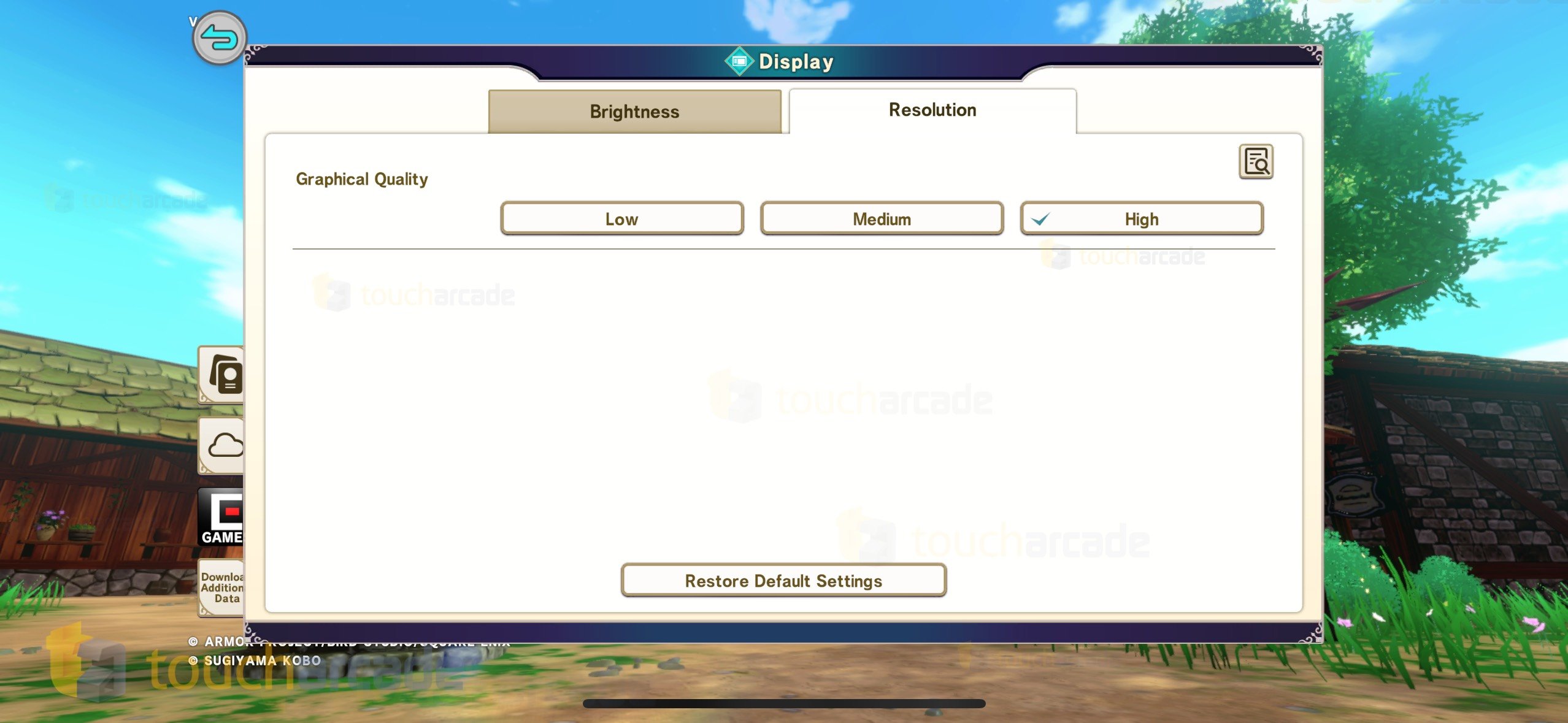
There aren’t specific visual or frame rate settings on mobile outside of the resolution option in display settings. This lets you play at low, medium, or high graphical quality options. These presets also affect other settings like the frame rate limit and post-processing. This setting can only be changed from the title screen on mobile while you can adjust it on the fly on PC. I stuck to the high setting on all my iPhones. Dragon Quest Monsters: The Dark Prince sadly has some minor performance issues even on iPhone 15 Pro as I mentioned above. The low setting seems unusable with how blurry it gets. On my 2020 iPad Pro, the high preset has more regular frame drops than iPhone, and it also seems to be running with some tweaked settings. Overall, even the older iPad Pro runs it well, but not as good as iPhone 15 Pro as expected. Every device I tested on including the iPhone 12 ran it a lot better than Nintendo Switch.

Visually, it looks a lot cleaner than Switch even on older iOS devices when played at high. Square Enix didn’t just do a bare-bones port here. It has fullscreen support during gameplay on my iPhone 15 Pro, and even has a pattern or artwork to fill the screen during areas with pre-rendered or static 16:9 elements. This pattern or artwork is mainly used on my iPad Pro since it doesn’t support fullscreen there for gameplay. This also applies to Steam Deck to make up for that aspect ratio in parts. I’m glad to see Square Enix put in the work here to make sure it still looks good regardless of aspect ratio.

Dragon Quest Monsters: The Dark Prince Steam Deck impressions

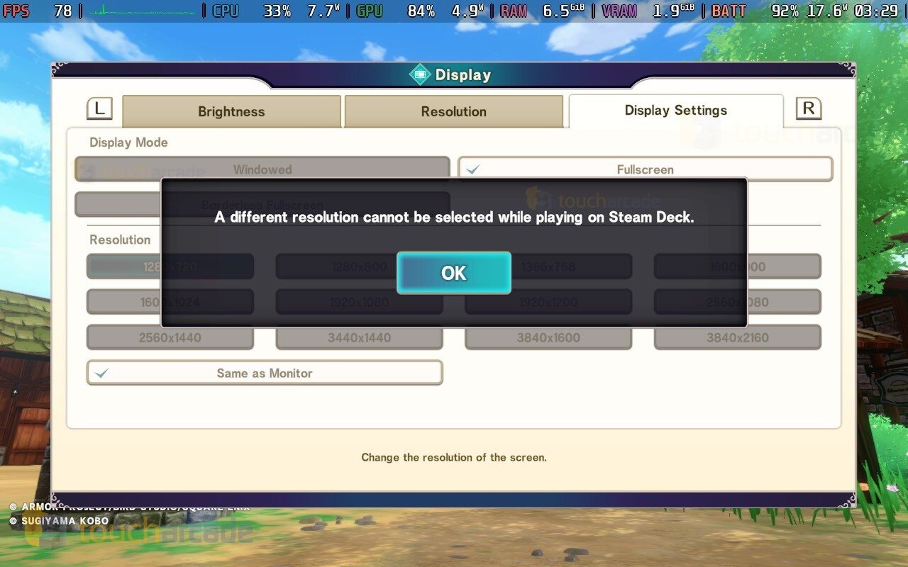
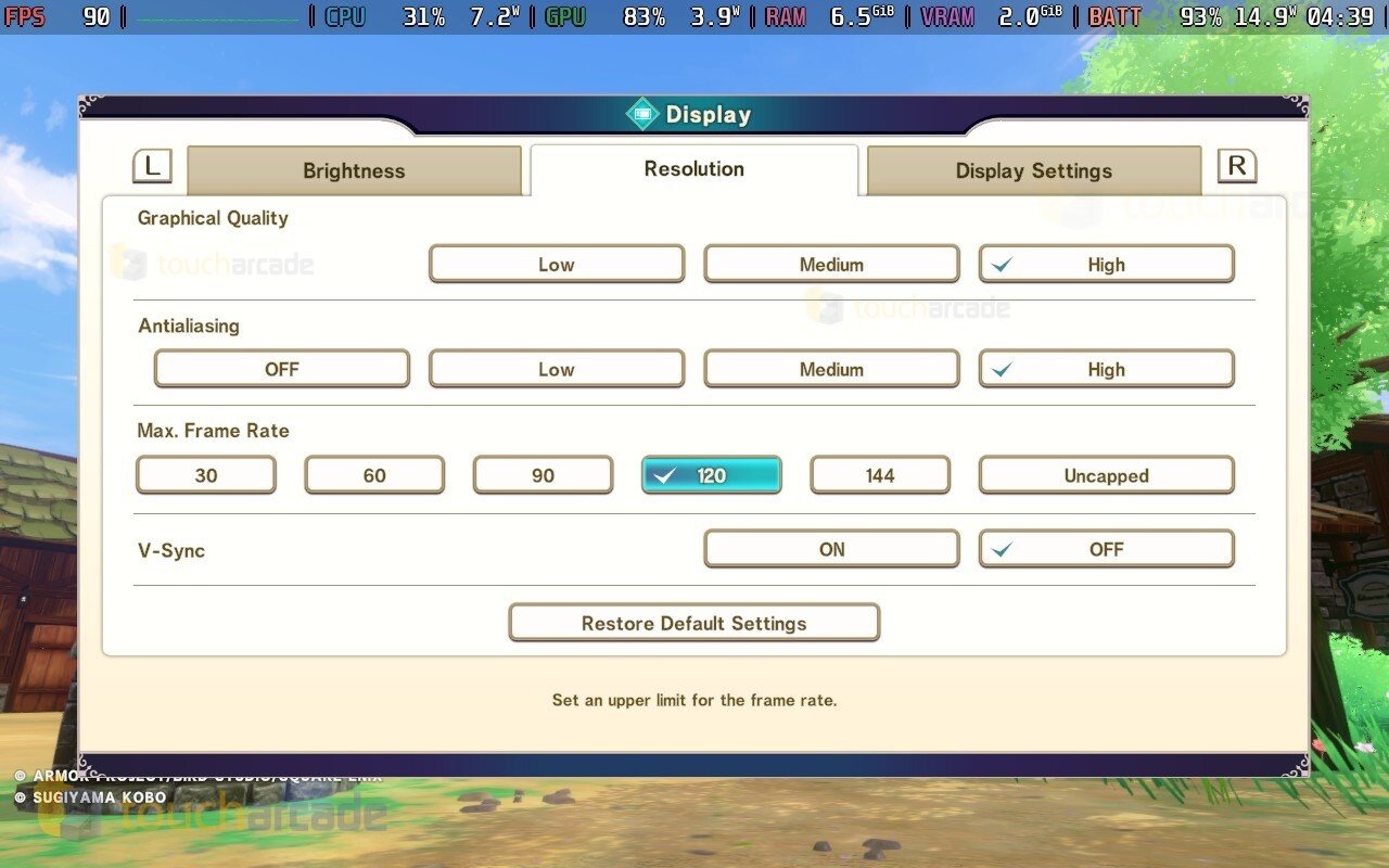
On Steam Deck, regardless of my settings, I couldn’t get Dragon Quest Monsters: The Dark Prince to run at a locked 90fps even at the low preset when played at 800p. I decided to opt for a 60fps target, and that was a lot easier to achieve. One oddity is the game not letting you adjust resolution when playing on Steam Deck normally. You can do this by forcing the resolution from the game’s properties before launching it. Dragon Quest Monsters: The Dark Prince on PC lets you adjust graphical quality (low, medium, high), anti-aliasing (off, low, medium, high), maximum frame rate (30 to uncapped), toggle v-sync, and adjust display mode (windowed, fullscreen, borderless). If you play at 60fps, I recommend setting your Steam Deck OLED refresh rate to 60 to avoid jitter as well.

Having now played Dragon Quest Monsters: The Dark Prince on iOS, iPadOS, Steam Deck, Switch OLED, and Switch Lite, there’s no doubt that the Switch version is the worst of the lot despite the online mode being removed from mobile and Steam. The massive increase in performance and better visuals with all DLC included at a much lower asking price only makes it better. One thing to note is that the game is marked as Steam Deck Playable and not Verified because Valve says some in-game text is small and may be difficult to read. I didn’t have any issues with this, and I feel like Valve has marked games with smaller text as Verified before. Either way, you can safely buy this one to play on Steam Deck.

If you skipped Dragon Quest Monsters: The Dark Prince on Switch, the new mobile and Steam ports are the way to go. While the mobile version lacking controller support is disappointing, it is still a game I see myself playing regularly with its improvements over switch and fantastic core gameplay loop. Having all the DLC included means you will have enough content to last you even longer. If you do value controller support in a game like this, the Steam Deck is the way to go. Hopefully we see Square Enix keep bringing more Dragon Quest games to mobile in the future. Right now, the iOS version of Dragon Quest Monsters: The Dark Prince is easily one of the best mobile releases of the year.

Marvel vs Capcom Fighting Collection: Arcade Classics Review – Switch, Steam Deck, and PS5 Covered

For a lot of folks who have been following Capcom’s fighting games over the years, the Marvel vs Capcom Fighting Collection: Arcade Classics announcement was unbelievable given recent events and the reception of the last Marvel vs Capcom game. As someone who has only played Ultimate Marvel vs Capcom 3 and Marvel vs Capcom Infinite, I had always wanted to play the earlier games given the praise a few of them got from competitive and casual players. I’d be lying if I said I also wasn’t just excited to hear the Marvel vs Capcom 2 music officially because it is that good. So here we are months after its announcement, and Marvel vs Capcom Fighting Collection: Arcade Classics is available on Steam, Switch, and PlayStation with Xbox coming in 2025.

Marvel vs Capcom Fighting Collection: Arcade Classics games included

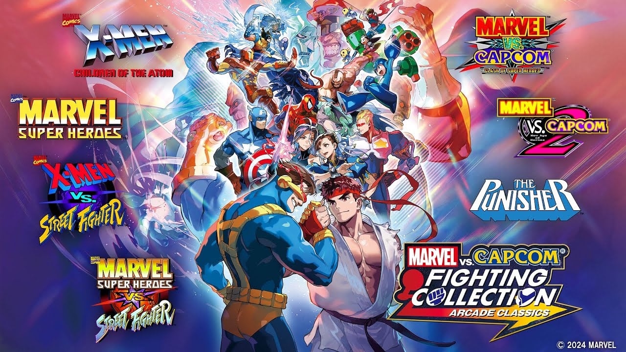
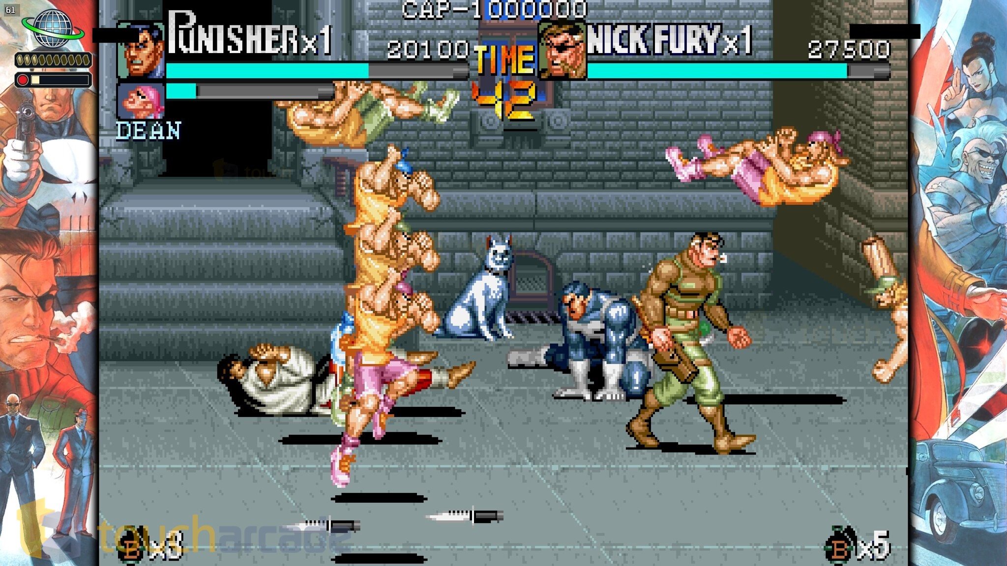
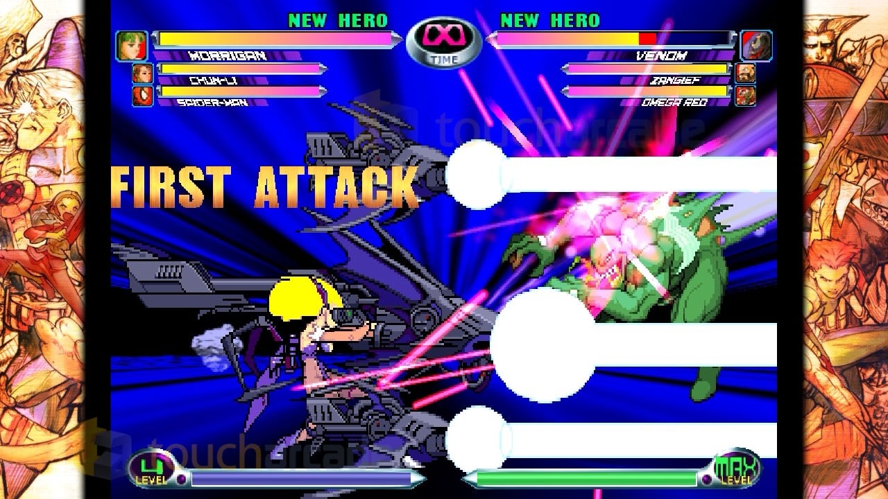
Marvel vs Capcom Fighting Collection: Arcade Classics ships with seven games included. They are: X-MEN CHILDREN OF THE ATOM, MARVEL SUPER HEROES, X-MEN VS. STREET FIGHTER, MARVEL SUPER HEROES vs. STREET FIGHTER, MARVEL vs. CAPCOM CLASH OF SUPER HEROES, MARVEL vs. CAPCOM 2 New Age of Heroes, and THE PUNISHER which isn’t a fighting game, but a beat ’em up. These are based on the arcade versions so you don’t need to worry about missing features like some older console ports here. These include the English and Japanese versions so yes, Marvel Super Heroes vs Street Fighter does include Norimaro in this collection when you choose the Japanese version for that game.

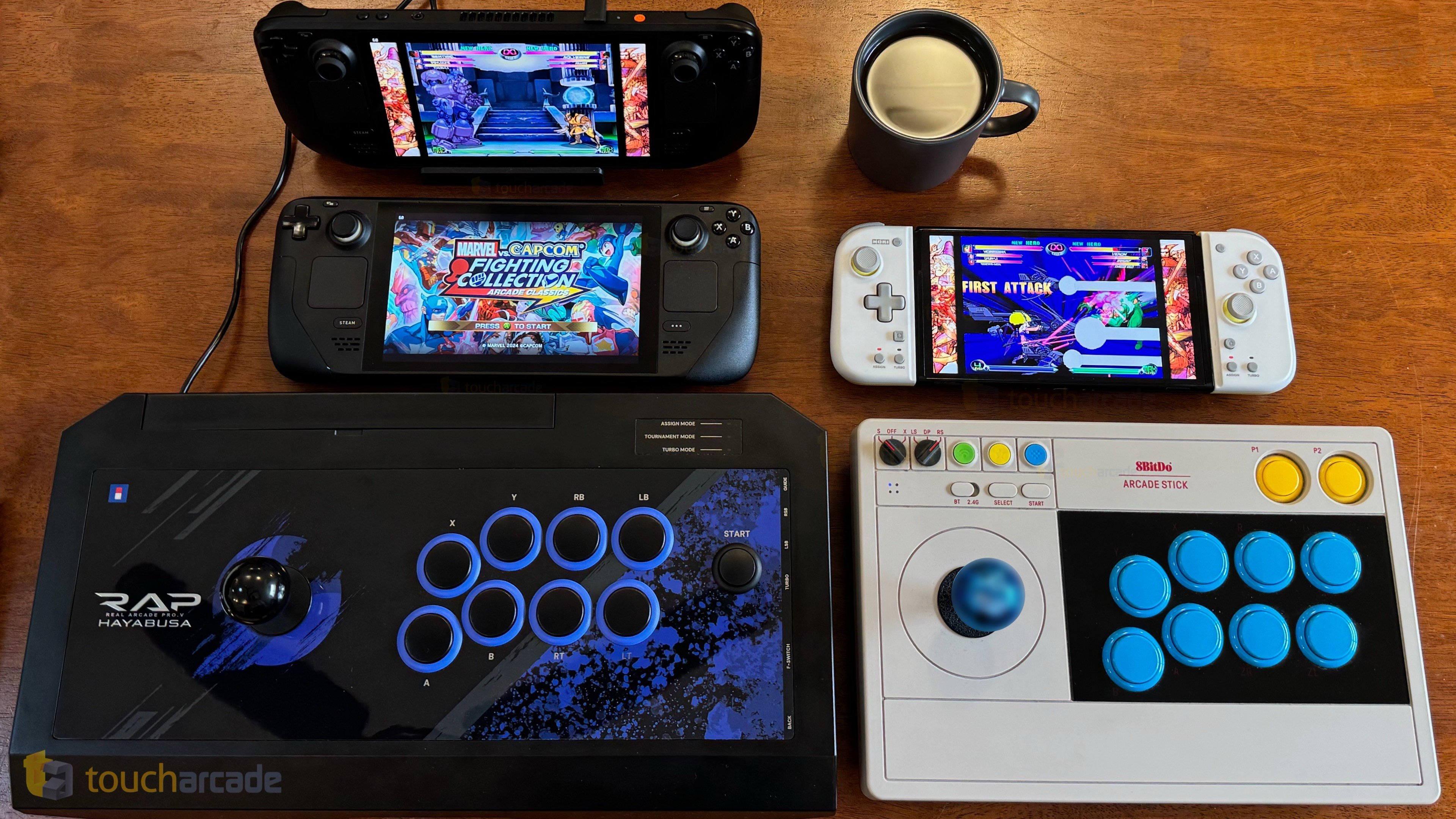
This review is based on me having played Marvel vs Capcom Fighting Collection: Arcade Classics for about 15 hours on Steam Deck (both LCD and OLED), 13 hours on PS5 (via backward compatibility), and about 4 hours on Nintendo Switch. I’m not qualified enough to talk about the ins and outs of the games included here because this collection was my first time playing them, but I will say that the fun I’ve had with Marvel vs Capcom 2 pre-release has more than justified the asking price to the point where I want to buy both console physical releases just to own a physical version of it.

Marvel vs Capcom Fighting Collection: Arcade Classics new features

If you played Capcom Fighting Collection, the interface and front-end of Marvel vs Capcom Fighting Collection: Arcade Classics will feel familiar. In fact, it even has the same issues that collection has, but I’ll get to that a bit later. Marvel vs Capcom Fighting Collection: Arcade Classics includes online and local multiplayer support, local wireless support on Switch, rollback netcode for online play, a training mode, customizable options for games, an important option to reduce white flashes or light flickering per game, various display options, and a few wallpaper options.

Outside the games, the training mode included (you can access this per game), includes hitboxes, inputs displayed, and other options making it even better for newcomers. Speaking of newcomers, Marvel vs Capcom Fighting Collection: Arcade Classics has a new one button super option that you can enable or disable when you play online and search for other players.

Marvel vs Capcom Fighting Collection: Arcade Classics museum and gallery

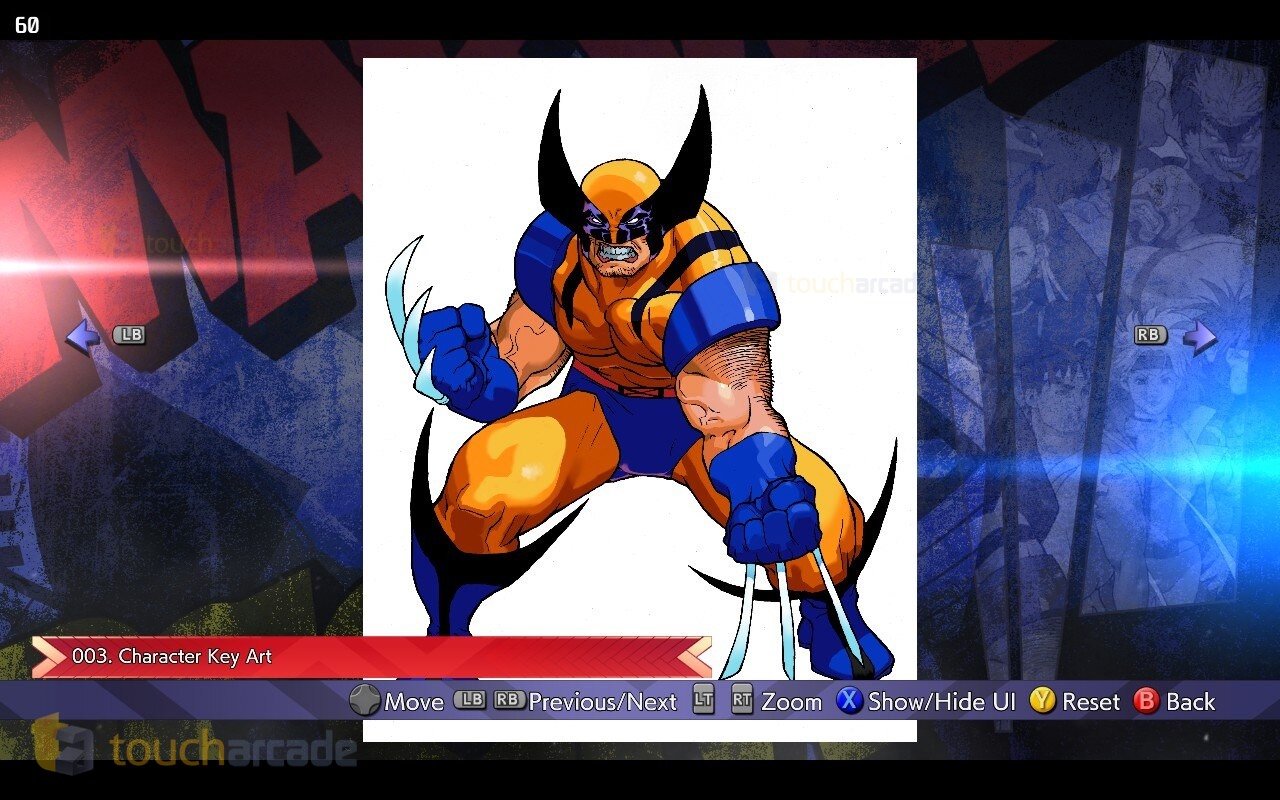
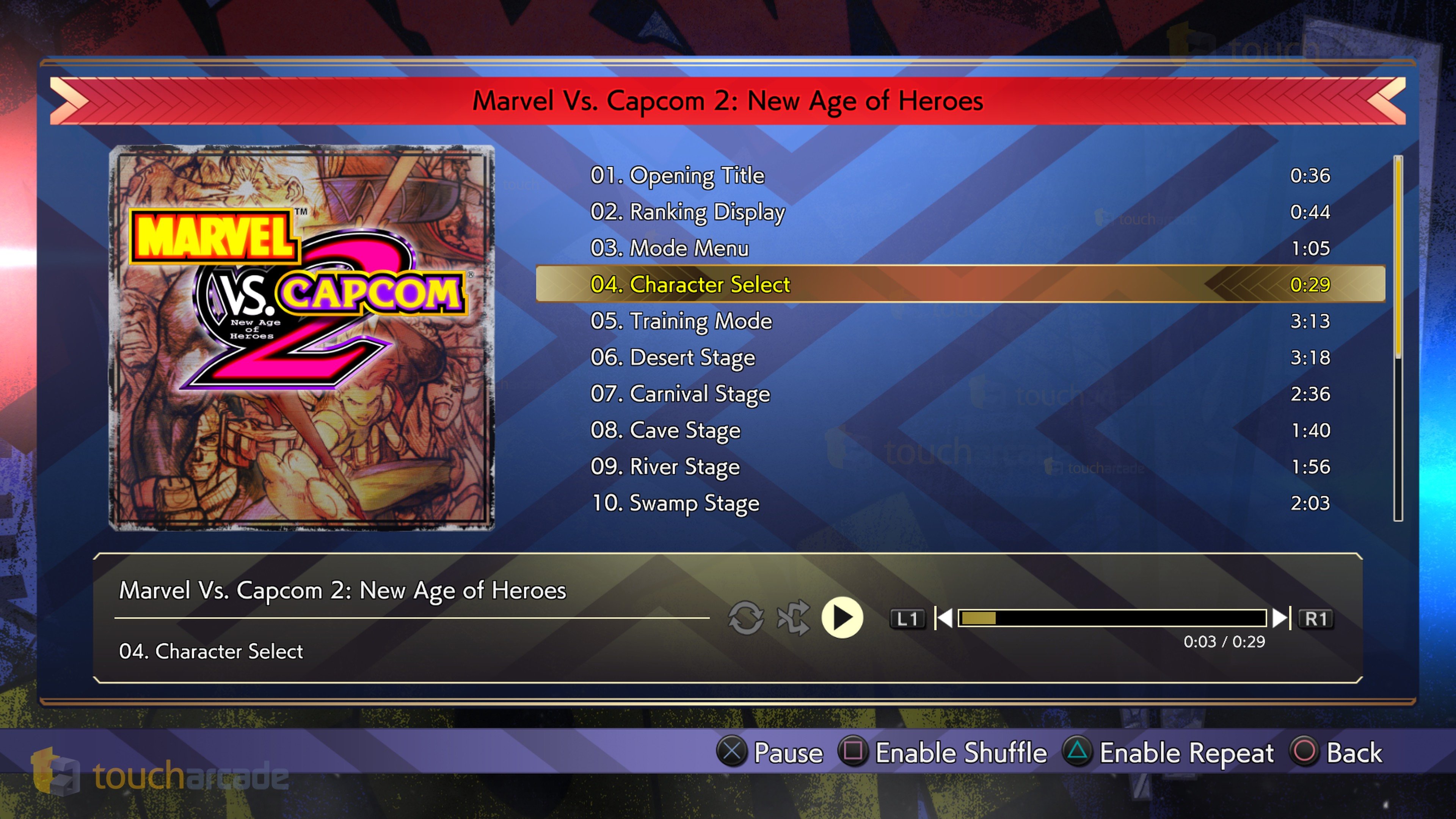
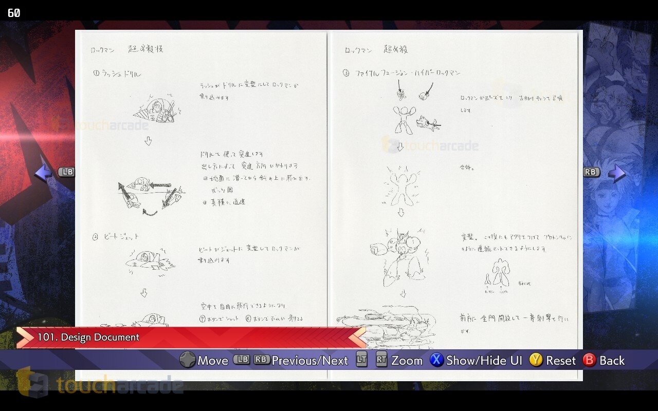
Marvel vs Capcom Fighting Collection: Arcade Classics also includes a robust museum and gallery with all the game soundtracks (more than 200 tracks) and more than 500 pieces of artwork. Having played Marvel vs Capcom Fighting Collection: Arcade Classics online with a friend who is also covering it, he let me know how a lot of the artwork in this collection has never been public before. For me, it is all new, but I thought that was notable for longtime fans. It is worth noting that things like sketches or design documents don’t have translations on them for any Japanese text.

As for the music, I’m glad we finally have an official way to listen to these soundtracks in 2024, but I hope this is the first step to getting a vinyl release or streaming releases for them.

How is the Marvel vs Capcom Fighting Collection: Arcade Classics online multiplayer experience with rollback netcode?

Before getting into the online experience, the options menu features its own network settings letting you enable or disable microphone, voice chat volume, input delay, and connection strength on PC. On Switch, you can only adjust input delay. The PS4 version lets you adjust input delay and connection strength with no voice chat options. I assume folks will use the PS5 and PS4 native voice chat options here instead of an in-game one. It is disappointing to see the Switch version lack a connection strength option as of the build I have.

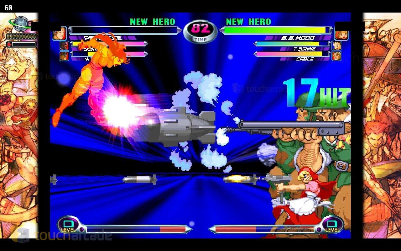
Pre-release, I only managed testing the online on Steam Deck wired and wirelessly with another player who was also on Steam. In our experience, Marvel vs Capcom Fighting Collection: Arcade Classics online is similar to Capcom Fighting Collection on Steam, but massively improved over Street Fighter 30th Anniversary Collection. You can adjust input delay and cross region matchmaking as well. We tested most of the games and also did a bit of co-op in The Punisher. It just works despite the distance between us.

Marvel vs Capcom Fighting Collection: Arcade Classics ships with matchmaking support for casual matches, ranked matches, and also leaderboards including a High Score Challenge mode.

I also want to note that when you rematch when playing online, the cursors remain correct so you can pick whoever you were playing as before in games like Marvel vs Capcom 2 instead of having to manually move the cursor each time to select your team. Little things like this add up to make the collection feel like a lot of love went into ensuring the best possible experience for players including ones learning the games for the first time.

Marvel vs Capcom Fighting Collection: Arcade Classics issues

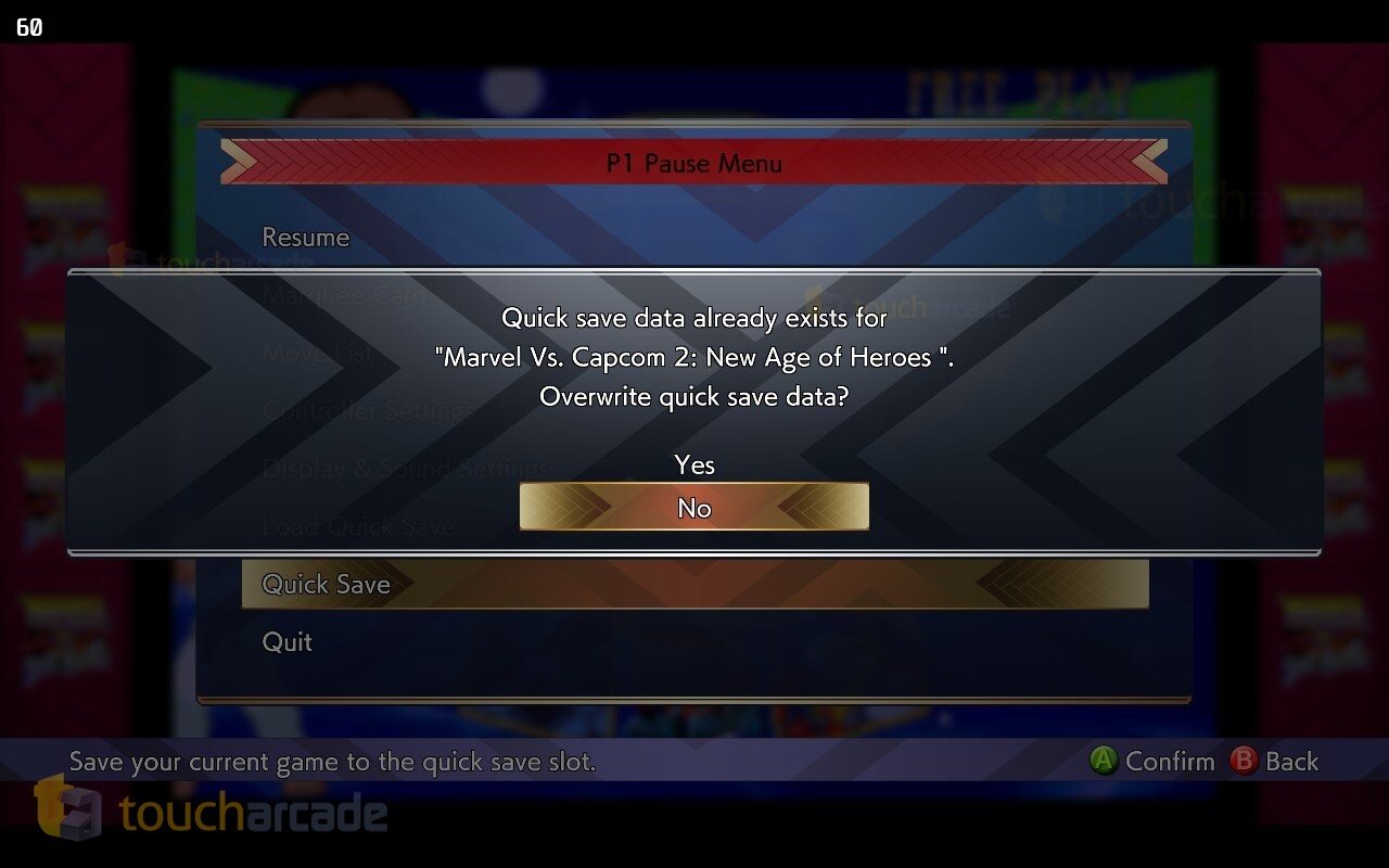
My biggest complaints with Marvel vs Capcom Fighting Collection: Arcade Classics are with how it has just a single save state (quick save) for the entire collection. This isn’t one single save state per game, but one for the entire collection. I was hoping this issue from Capcom Fighting Collection wouldn’t carry over but here we are. Another minor complaint and settings not being universal or an easy apply or toggle the light reduction or adjust visual filters at once. Having options per game is good, but I would’ve liked to just enable light reduction and turn off the filter for every game at once.

Marvel vs Capcom Fighting Collection: Arcade Classics on Steam Deck – Verified already

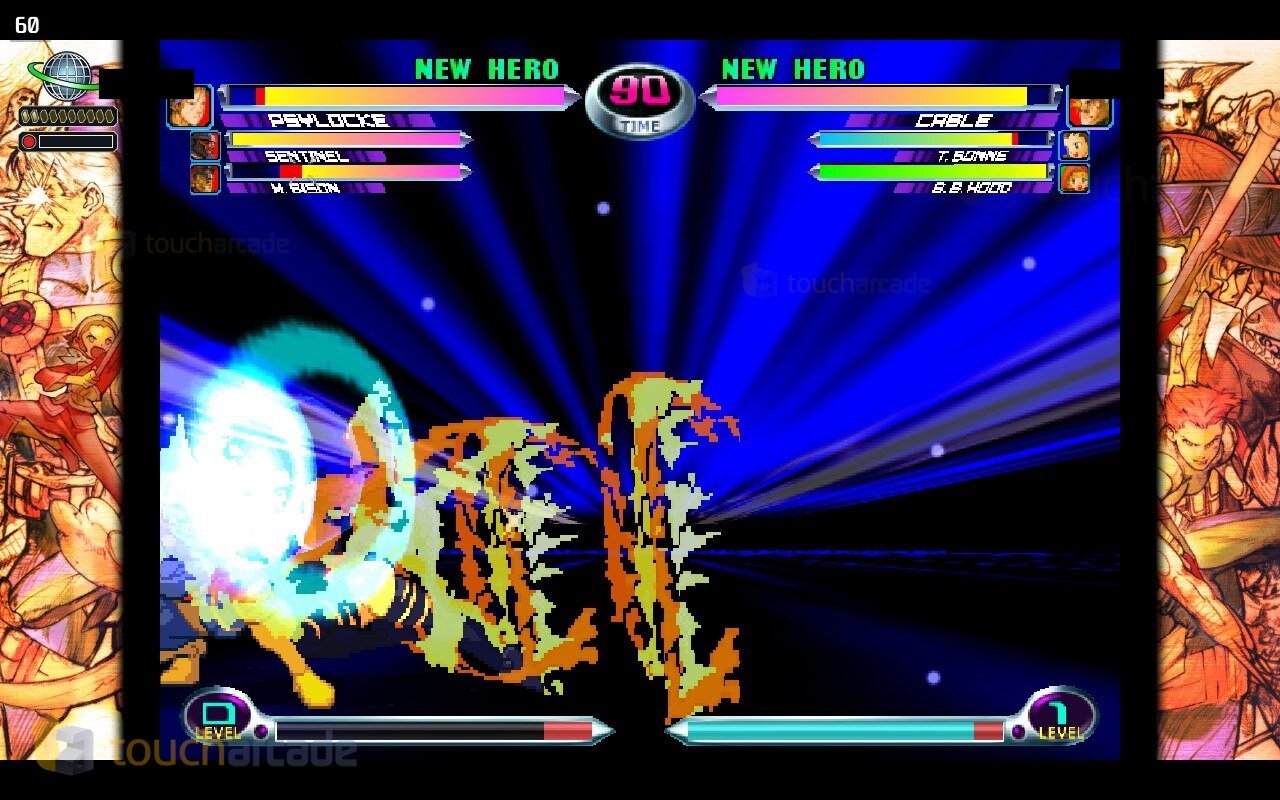
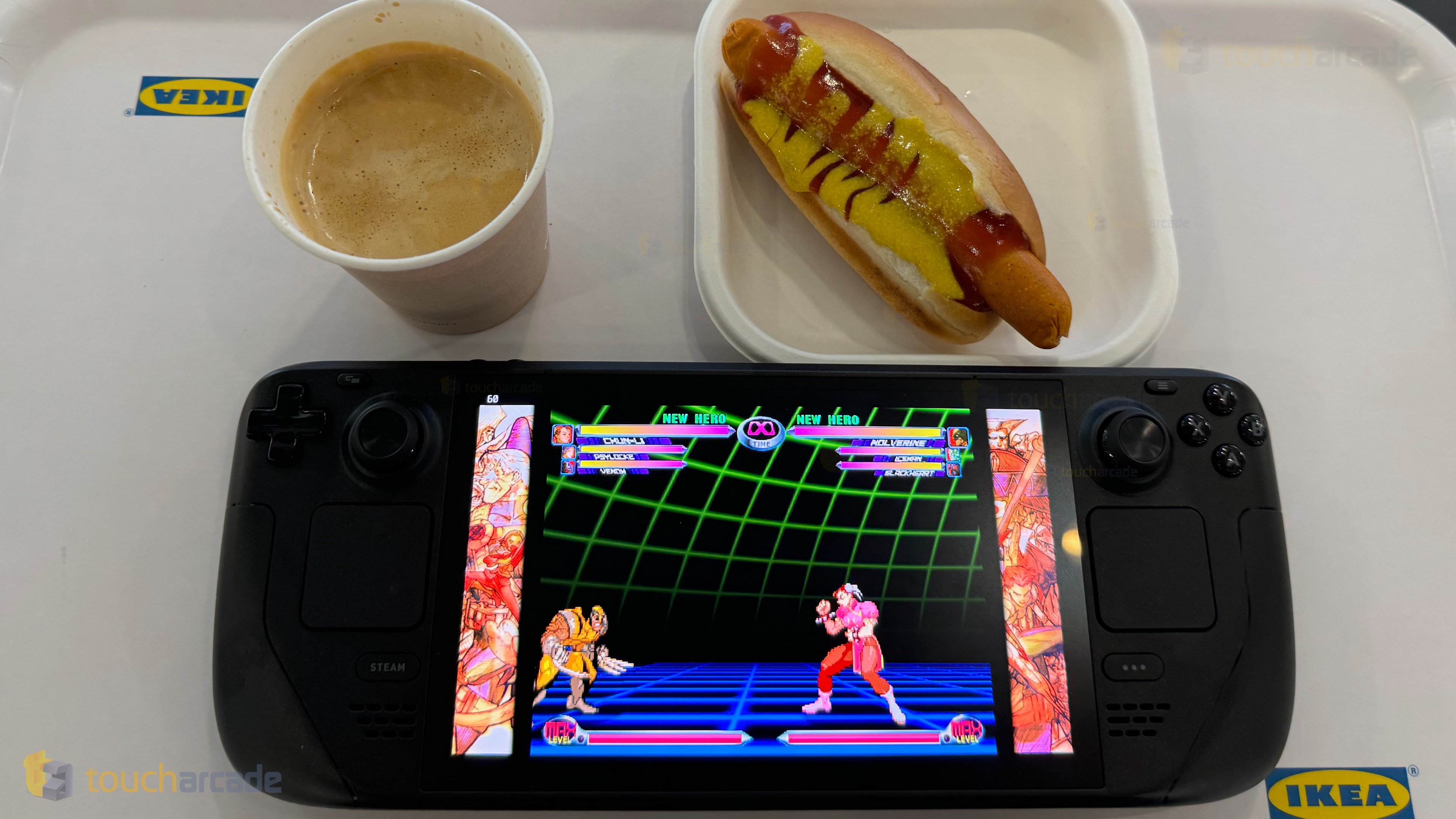
I first tried Marvel vs Capcom Fighting Collection: Arcade Classics on Steam Deck and it works perfectly out of the box. Given it is Steam Deck Verified I shouldn’t be surprised, but you can never tell with new games until you try them yourself. When played on the Deck itself, Marvel vs Capcom Fighting Collection: Arcade Classics runs at 720p and it supports 4K when docked. I played at 1440p for the most part docked and then 800p handheld. It is still 16:9 though with no 16:10 support.

The Marvel vs Capcom Fighting Collection: Arcade Classics PC graphics options are under the PC Settings menu in options. These let you adjust resolution, display mode (fullscreen, borderless, windowed), and toggle v-sync.

Marvel vs Capcom Fighting Collection: Arcade Classics on Nintendo Switch

While Marvel vs Capcom Fighting Collection: Arcade Classics looks fine on Switch, the biggest downgrade from other platforms is the load times. Going in and out of games on Steam and PS5 is almost instant while the Switch version has loading for basically everything. This adds up and since I’ve been playing it on all three platforms at once, it was very noticeable. I hope the connection strength option is added eventually as well since PlayStation and PC have it. The Switch version does support local wireless while the others do not though.

Marvel vs Capcom Fighting Collection: Arcade Classics on PS5

I wish Marvel vs Capcom Fighting Collection: Arcade Classics was native on PS5 rather than played via backward compatibility because PS5 Activity Card support would’ve been amazing to get in and out of different games from the dashboard. Barring that, it looks excellent on my 1440p monitor and loads quickly even when played off an external hard drive. You can move it to the SSD for even faster loading. I have no complaints with the PS4 version on PS5.

Marvel vs Capcom Fighting Collection: Arcade Classics is one of Capcom’s best collections yet across everything and not just fighting games or arcade games. It offers superb extras, fantastic online play on Steam, and it has been a joy to experience these games for the first time. I just wish there was more than one save slot for the entire collection for save states.

Marvel vs Capcom Fighting Collection: Arcade Classics Steam Deck Review Score: 4.5/5

Razer Kishi Ultra Mobile Controller Review – The Best Mobile Controller in 2024?

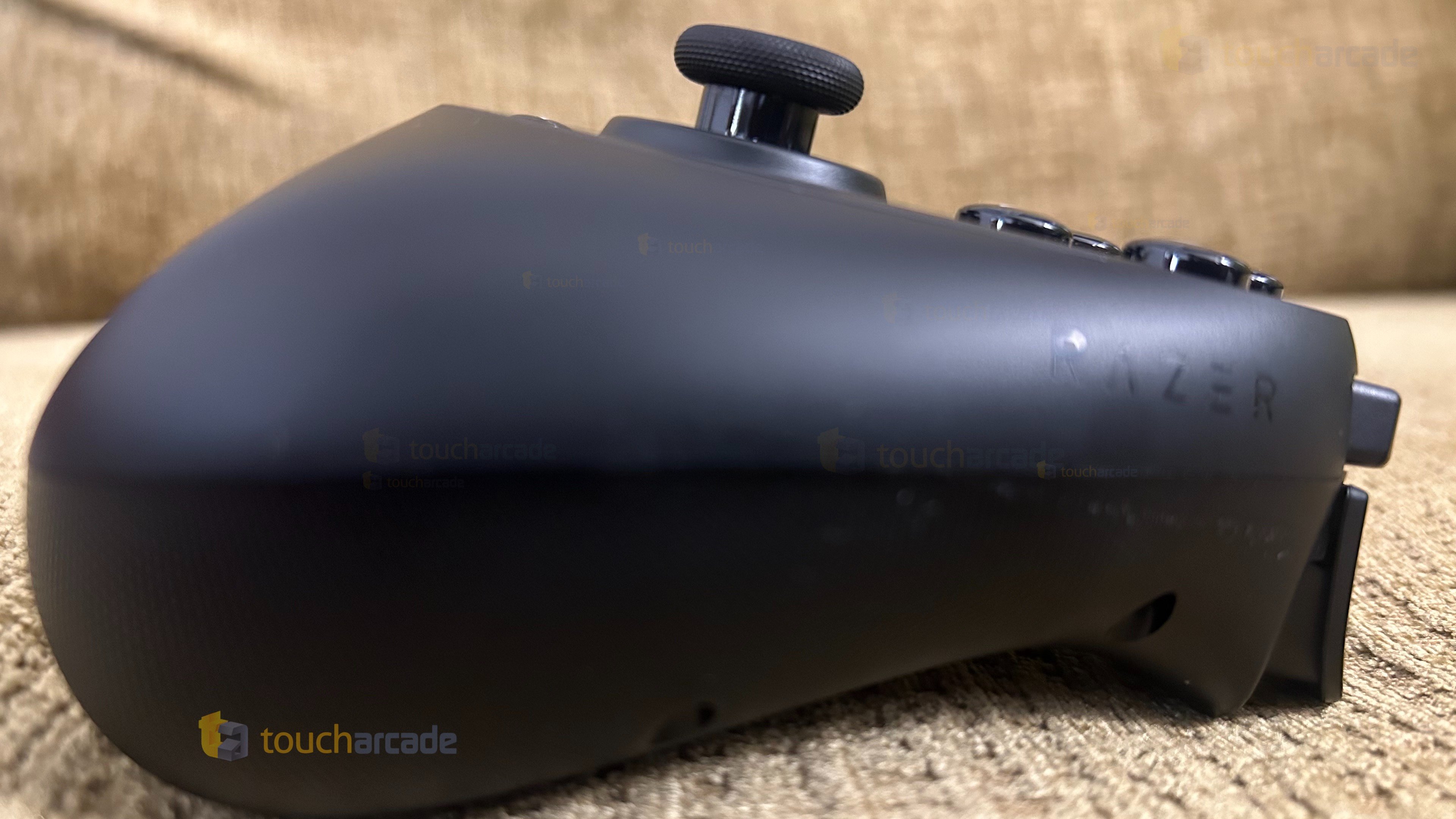
Back in April, the Razer Nexus (Free) app on iOS and Android was updated with support added for an unannounced “Razer Kishi Ultra” controller boasting features like analog stick deadzone customization and more. Since then, Razer has announced and released the Razer Kishi Ultra with support for more than just phones. The Razer Kishi Ultra is also the most expensive mobile controller as far as I’m aware, but it offers more features than expected for specific devices. Having used the Razer Kishi and the Backbone One including the new USB-C versions for years now, I didn’t think I needed a new controller, but the Razer Kishi Ultra changed my mind in a way the Hori Split Pad Pro did on Nintendo Switch a few years ago.

Razer Kishi Ultra – what’s in the box

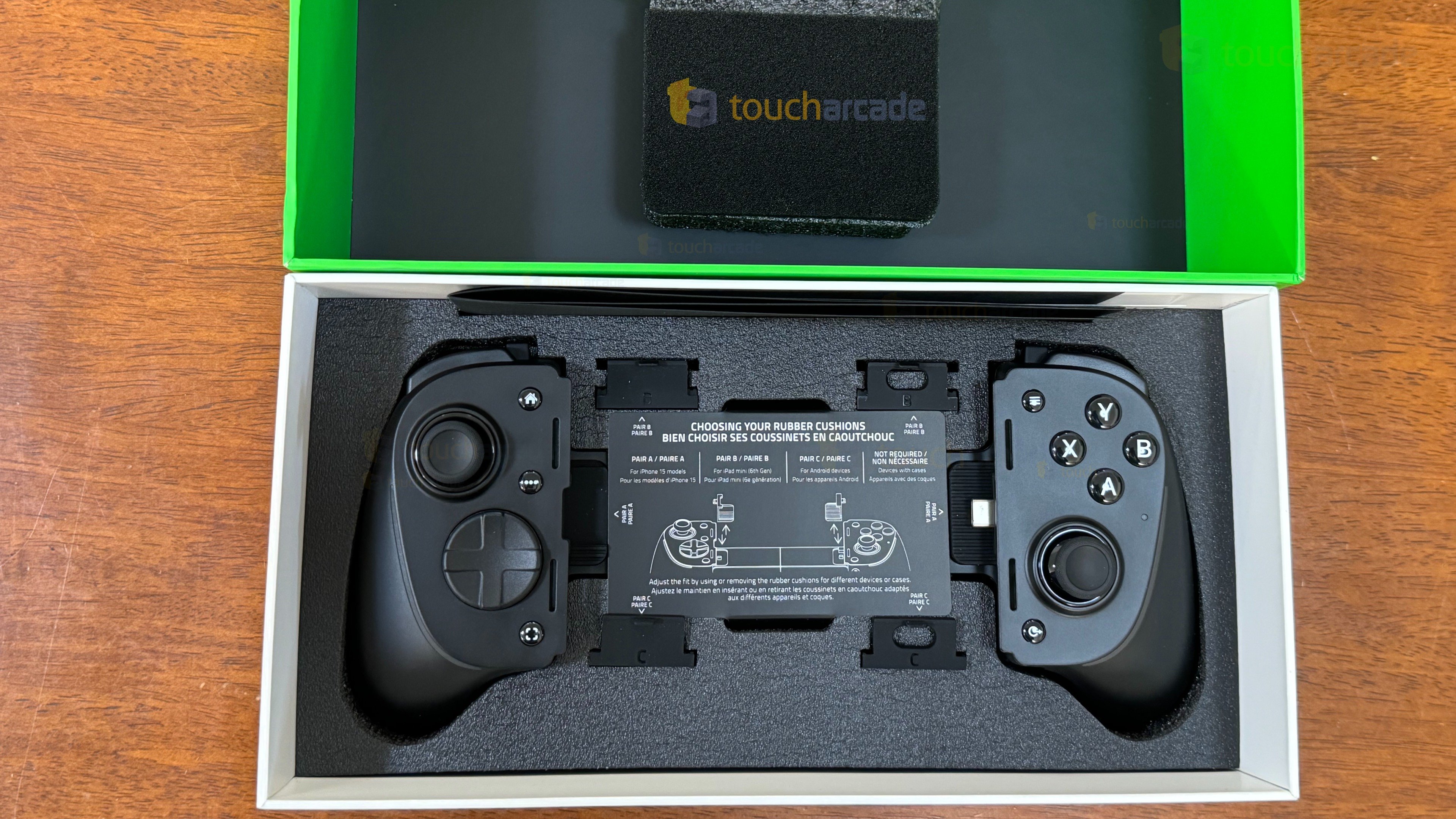
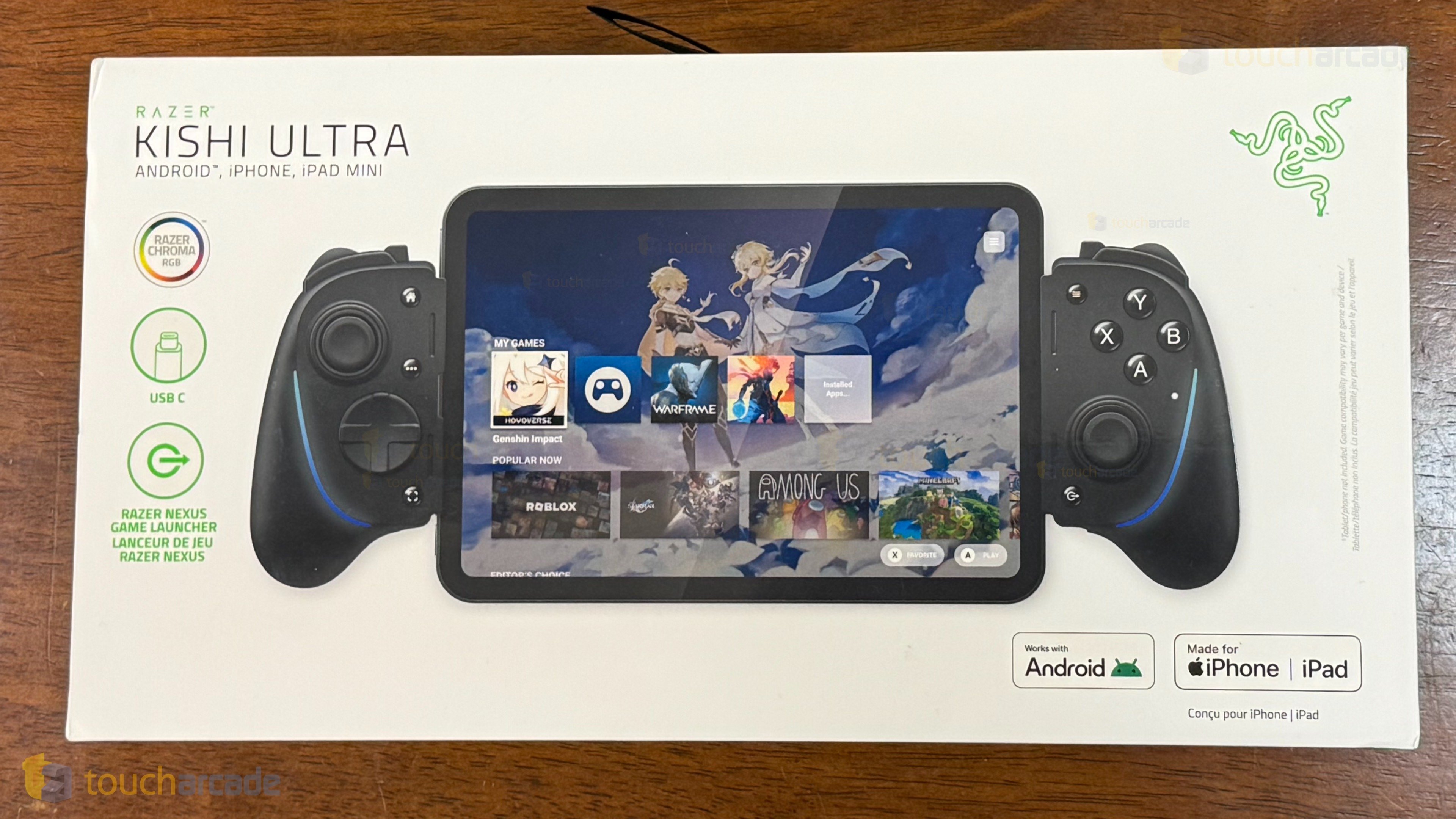
The Razer Kishi Ultra box included the controller itself, a few sets of rubber cushions to use depending on your device, a sheet of stickers, and an instruction booklet. For the price point of $149.99, I expected to have a carrying case or at least a pouch included. Beyond that, the box and casing for the controller in the box are good quality as usual from Razer.

The Razer Kishi Ultra rubber cushions come in pairs that are properly labeled for use with iPhone (Pair A), iPad Mini 6th generation (Pair B), and Android (Pair C). If you use a case, you don’t need to use any of these rubber cushions.

Razer Kishi Ultra compatibility – iPhone, Cases, Android, and iPad Mini

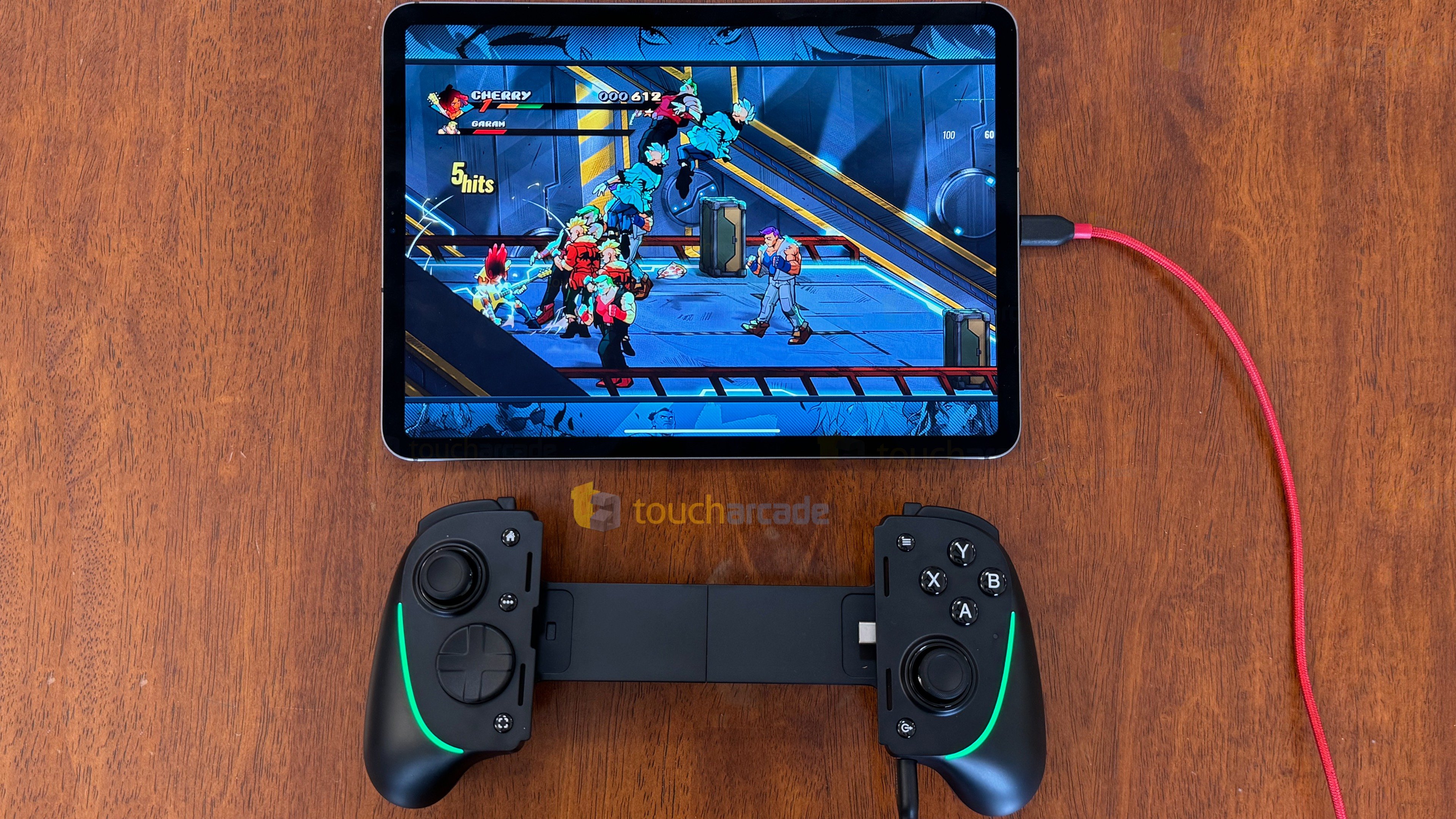
While most mobile controllers, especially the telescopic ones, only support iPhone and Android, the Razer Kishi Ultra also supports tablets like the iPad Mini 6th generation. We’ve also recently had some telescopic controllers ship with bluetooth support, but as for USB-C, this one seems to have some of the best compatibility. For the purpose of this review, I tested the Razer Kishi Ultra on my iPhone 15 Pro, iPhone 14 Plus, and wired on my iPad Pro. I didn’t test on Android or Windows, but I did try it on my Steam Deck wired. It is detected as a generic Xbox gamepad, but it did work when I was playing NBA 2K25 on Steam Deck yesterday for review and it also supports decent rumble in games like Bakeru that I tested with.

Razer Kishi Ultra buttons, d-pad, and triggers

Before getting to the new features, how does the Razer Kishi Ultra actually feel and perform? I was a bit worried about the d-pad, but it ended up working great when I played games like Garou: Mark of the Wolves ACA NeoGeo or even newer ones like Hades and Hitman Blood Money Reprisal. Beyond the d-pad, the shoulder buttons and triggers work well just like Razer’s older controller. The analog sticks are comfortable and smooth to use with the face buttons being clicky albeit with more travel distance which I didn’t expect after the original Razer Kishi.

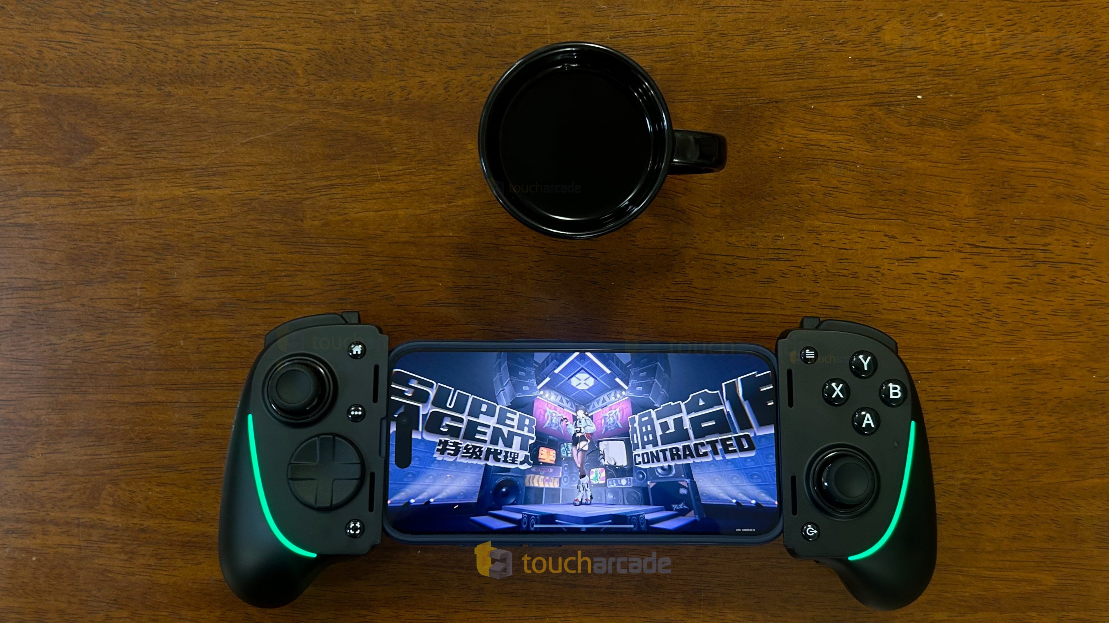
Overall, I have no complaints with the Razer Kishi Ultra d-pad, buttons, or triggers after considerable use including some sessions lasting a few hours where I played Zenless Zone Zero while charging my phone through the passthrough charging here.

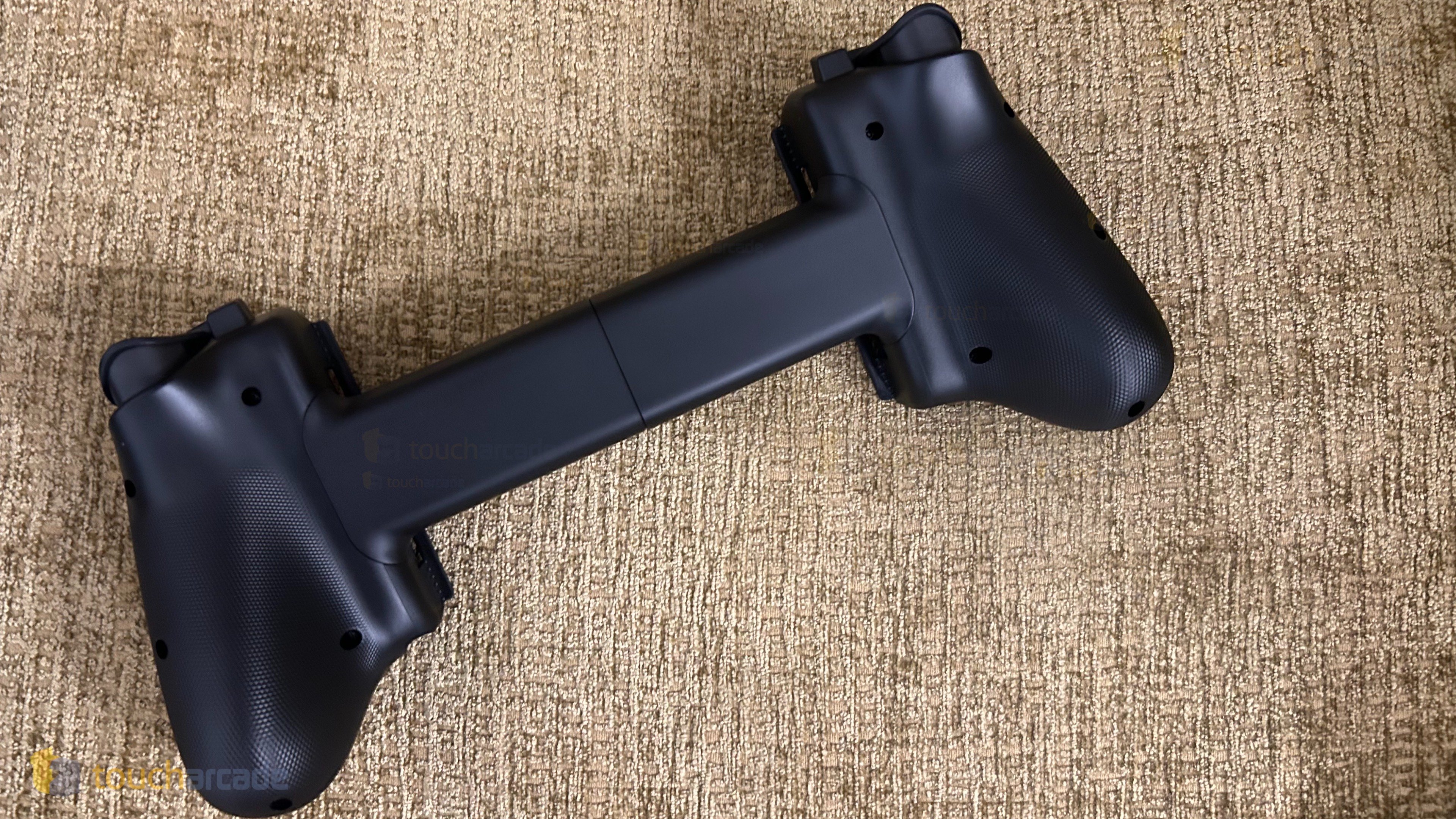
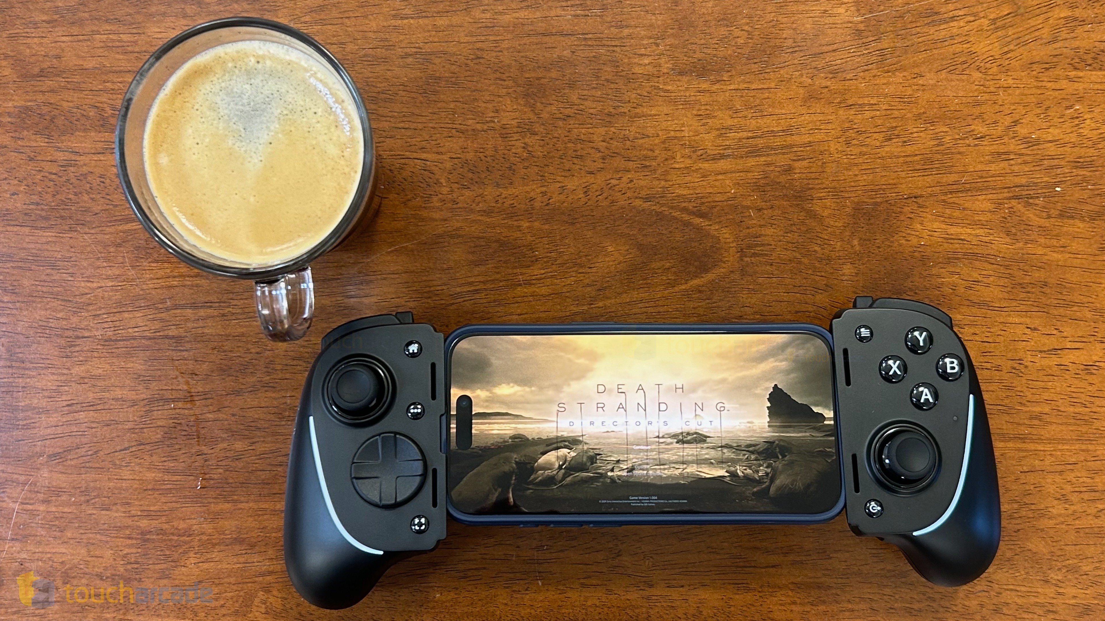
In terms of feel, the textured finish isn’t rubbery, but it works well for a grip and remains very comfortable to hold even for a few hours. I don’t usually care for Chroma stuff on controllers, and just like the Razer Kitsune, I would’ve preferred if the lights could somehow match the gameplay on screen.

Razer Kishi Ultra – new features

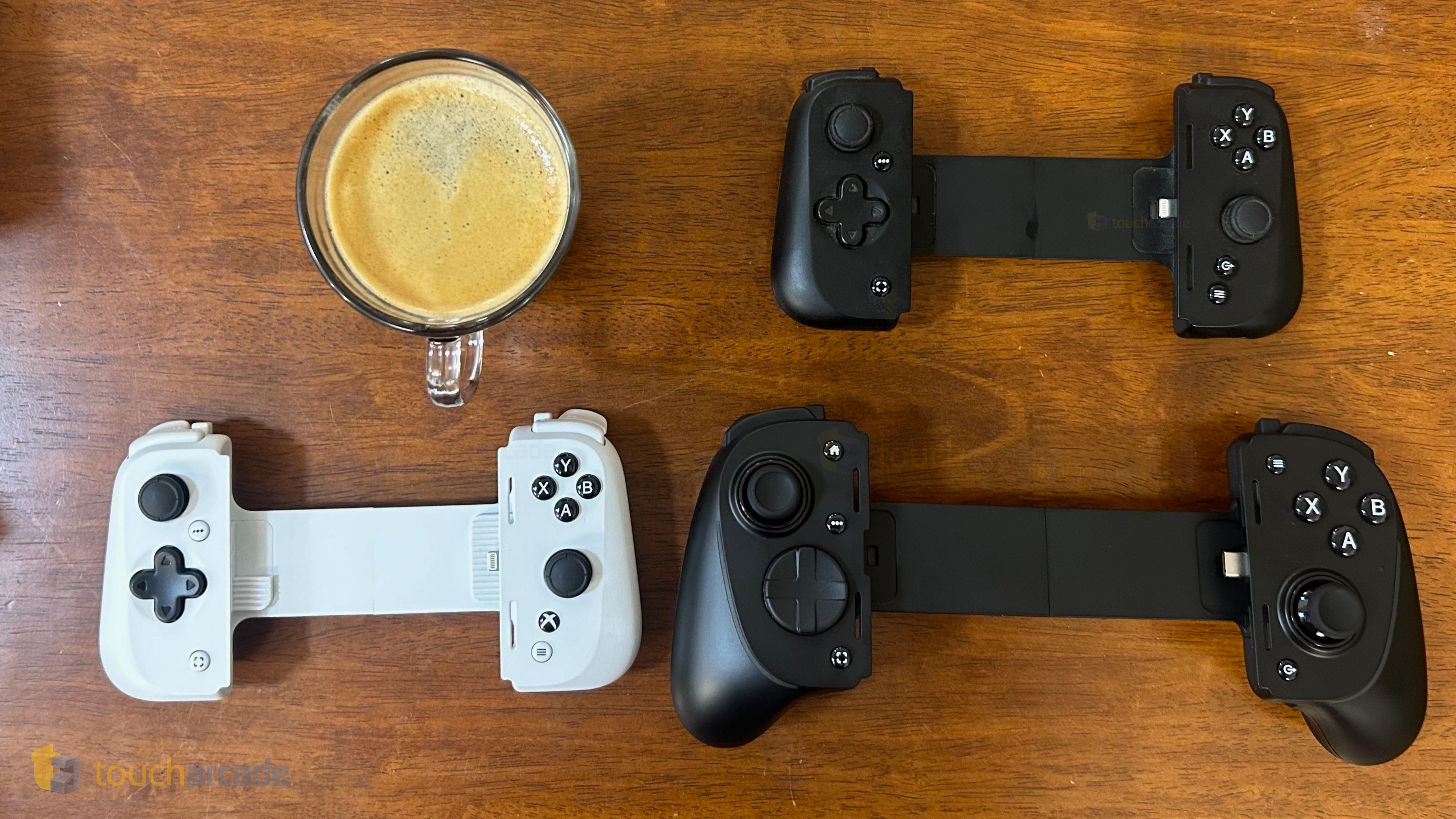
The main draw of the Razer Kishi Ultra is the full-size form factor. Instead of feeling like a compact mobile controller as we’ve seen with Razer’s prior release or the Backbone One, the Razer Kishi Ultra is a full-size one that feels like you’re holding your phone in the middle of a good quality console controller. This may not be a plus for some looking for a compact solution, but it isn’t meant to be that. The full-size form factor makes this the comfiest mobile controller I’ve used by far.

The other features are the Chroma customization through the app, haptics (for Android and Windows), and virtual controller mode (Android only). The virtual controller mode is good for Android games since we see some notable ones skip adding controller support outside iOS on mobile like Genshin Impact.

Aside from the new features, the Razer Kishi Ultra has a 3.5mm headphone jack, passthrough charging (15W), and the L4 and R4 shoulder buttons.

Razer Kishi Ultra features missing on iOS – haptics and virtual controller mode

The haptics and virtual controller mode are only available on Android (or Windows as well for the former) and not available on iOS. I don’t really care about virtual controller mode, but I hope Razer can work on something to enable the haptics in some way for iOS devices as well. I love haptic feedback on PS5 and HD Rumble on Switch, so having something that tries to do similar things on iOS would be nice.

Razer Kishi Ultra price point – is it worth it?

I already think most folks are better off getting a PS5 or Xbox controller to play wirelessly on iOS as the best possible and cheaper option. If you do want a good controller that has a telescopic form factor and attaches onto your phone, the most popular options are already $99.99 so the Razer Kishi Ultra at $150 is definitely a more premium controller. Is it worth that much more? If you’re ok with the current Razer Kishi and Backbone One price point, this is definitely worth the extra price for the comfort, but the lack of the haptics makes it feel like a lesser experience on iOS compared to Android where you get the fully featured experience.

It remains to be seen if the joysticks on this one don’t drift over time as well.

Razer Kishi Ultra – the best mobile controller in 2024?

If you’ve not read my review of Razer’s older controller, check it out here. Moving from that more compact form factor that I’ve gotten used to for years across Razer and Backbone products to this big one has been interesting. Just like the Hori Split Pad Pro for Nintendo Switch, I find myself wanting both a full-size controller and a more compact one for iPhone.

The Razer Kishi Ultra is easily the comfiest mobile controller I’ve ever used, but I wish it was easier to travel with. I worry about how it might end up in my bag unless I carry it in the big box it ships with. I don’t know if the Razer Kishi Ultra will replace my normal Kishi or Backbone One when I travel, but I’m definitely only using it when I play at home.

At the asking price, I was hoping for hall effect analog sticks though. I’ve had drift issues with multiple controllers over the years and while it hasn’t happened to the Razer Kishi Ultra yet (or the Razer Kishi itself), but I can’t say how things might be in a few more months. This is more of a thing to keep in mind when you buy it.

Having now covered the Backbone One and Razer Kishi models, I definitely want to try out the GameSir lineup as they seem more than worth checking out. Hopefully in the near future.

Razer Kishi Ultra 2 wishlist

When thinking about what I’d like to see in an updated Razer Kishi Ultra, aside from hall effect sticks, I’d like some of the sharper edges like the passthrough charging port to be smoothed out a bit. Beyond that, while I love the L4 and R4 buttons as options, I vastly prefer having paddles on the bottom of the controller since they feel more natural to use. It would be good to have those as options given the premium price. Maybe even L5 and R5 as paddles on the bottom with remapping available in the Razer Nexus app. The final thing I want is a carrying case for this to come with the controller. When looking at the pro level controllers on console, they usually come with a nice hard case. Granted this one doesn’t cost as much as a DualSense Edge or Victrix Pro BFG, but it would be a nice addition to the package that wouldn’t cost too much.

Razer Kishi Ultra review

If you’re used to playing on traditional PS5 or Xbox Series controllers or basically any full-sized controller and don’t enjoy using the compact Joy-Con size buttons and sticks we usually see in mobile controllers, the Razer Kishi Ultra is perfect for you with its comfortable grip, great d-pad, and face buttons. The lack of full feature support on iOS is disappointing, but this is a great addition to the mobile controller space, and I hope Razer can build on this through the years while also offering a carrying case so I don’t have to worry about anything happening to this in my bag when I go out.

Razer Kishi Ultra review score: 4.5/5

Amazon Link: Razer Kishi Ultra

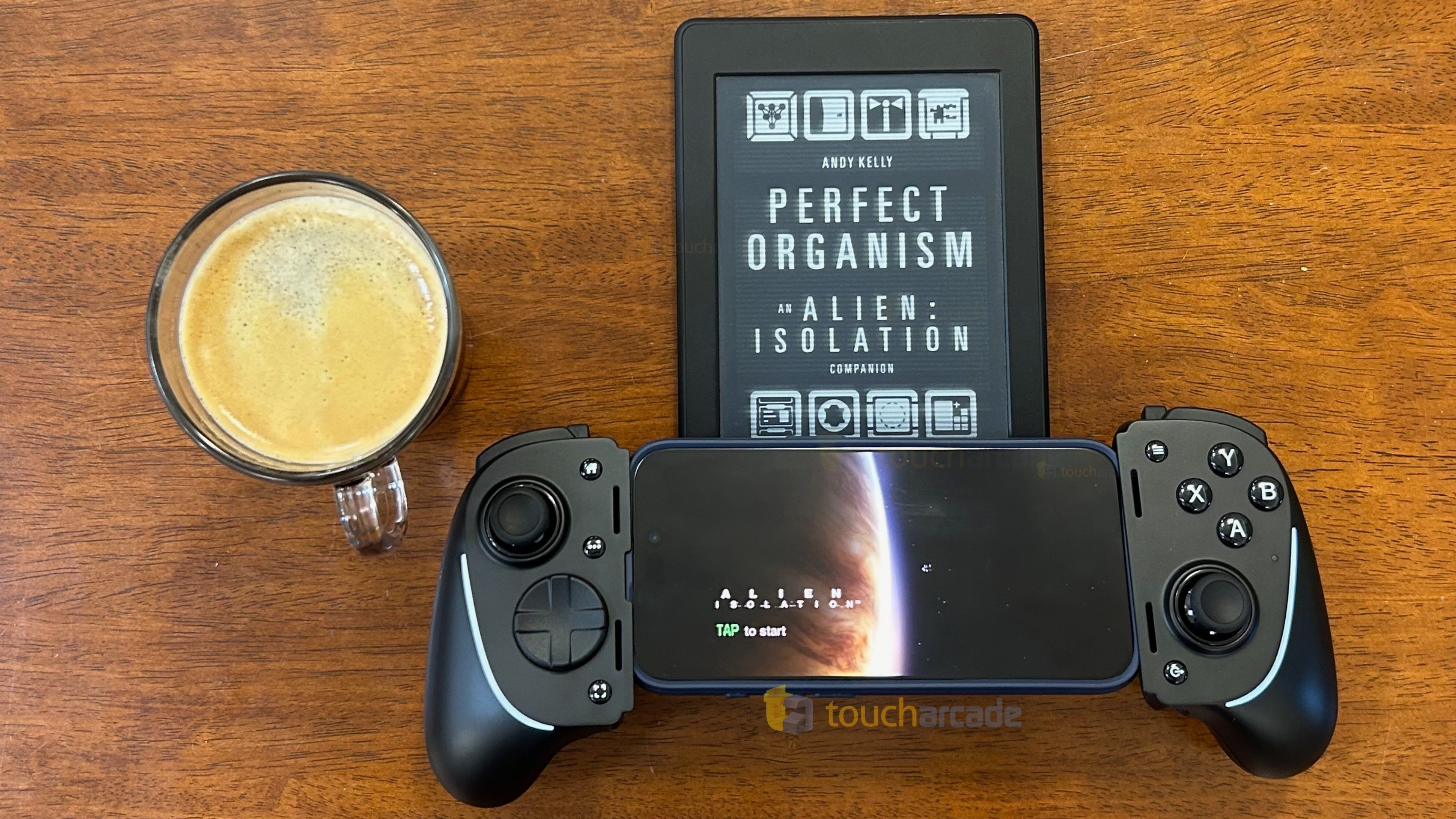
If you’re curious about the book in the header image, it is Andy Kelly’s upcoming book titled Perfect Organism: An Alien: Isolation Companion that I’m currently reading for review. You can pre-order it here.

Disclaimer: TouchArcade may earn a small commission from purchases made using the affiliate links above.

‘Harvest Moon: Home Sweet Home’ iOS Review – A Great Start, but Needs More Work

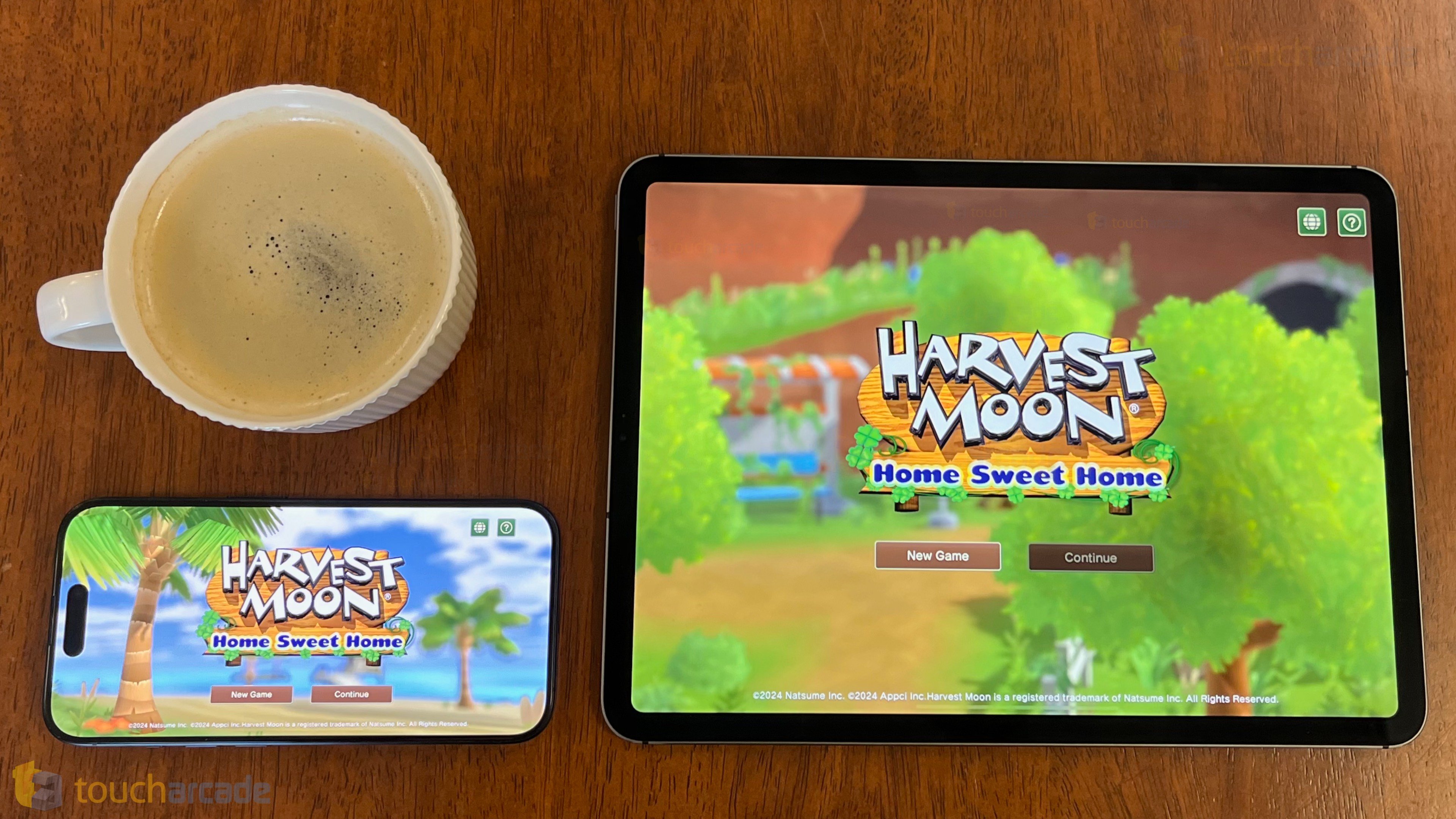
Harvest Moon: Home Sweet Home has been a very interesting game to follow pre-release. I say this not only because it is a premium mobile-first Harvest Moon game, but also because the reactions from my friends who are longtime fans of the series have gone from apathy to interest with every bit of gameplay shown. Harvest Moon: Home Sweet Home launched recently on iOS and Android as a mobile-exclusive entry in Natsume’s Harvest Moon series, and I’ve been playing it for about a week and a half now on iPhone 15 Pro and iPad Pro for review. Harvest Moon: Home Sweet Home is a very good farming simulation game, but one that is held back by a few issues right now.
A lot of fans of the Harvest Moon series of games from Marvelous have been around since the SNES or N64 days, but I only got into it on 3DS with Story of Season. Back then, I had no idea about the name change and that Marvelous’ releases would be called Story of Seasons while Harvest Moon would be the name used by Natsume going forward. I’m making that clear now because I don’t want people confused about what Harvest Moon: Home Sweet Home is and also to give you my history with the series before getting into how I feel about Harvest Moon: Home Sweet Home ($17.99).

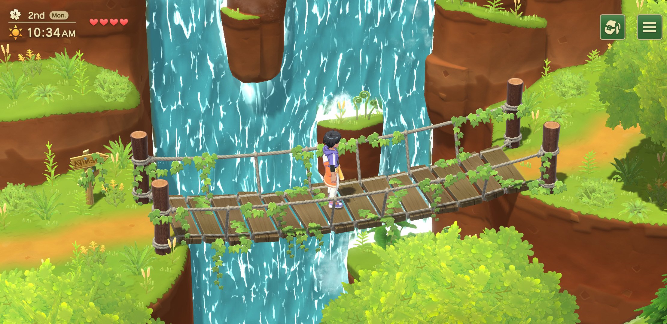
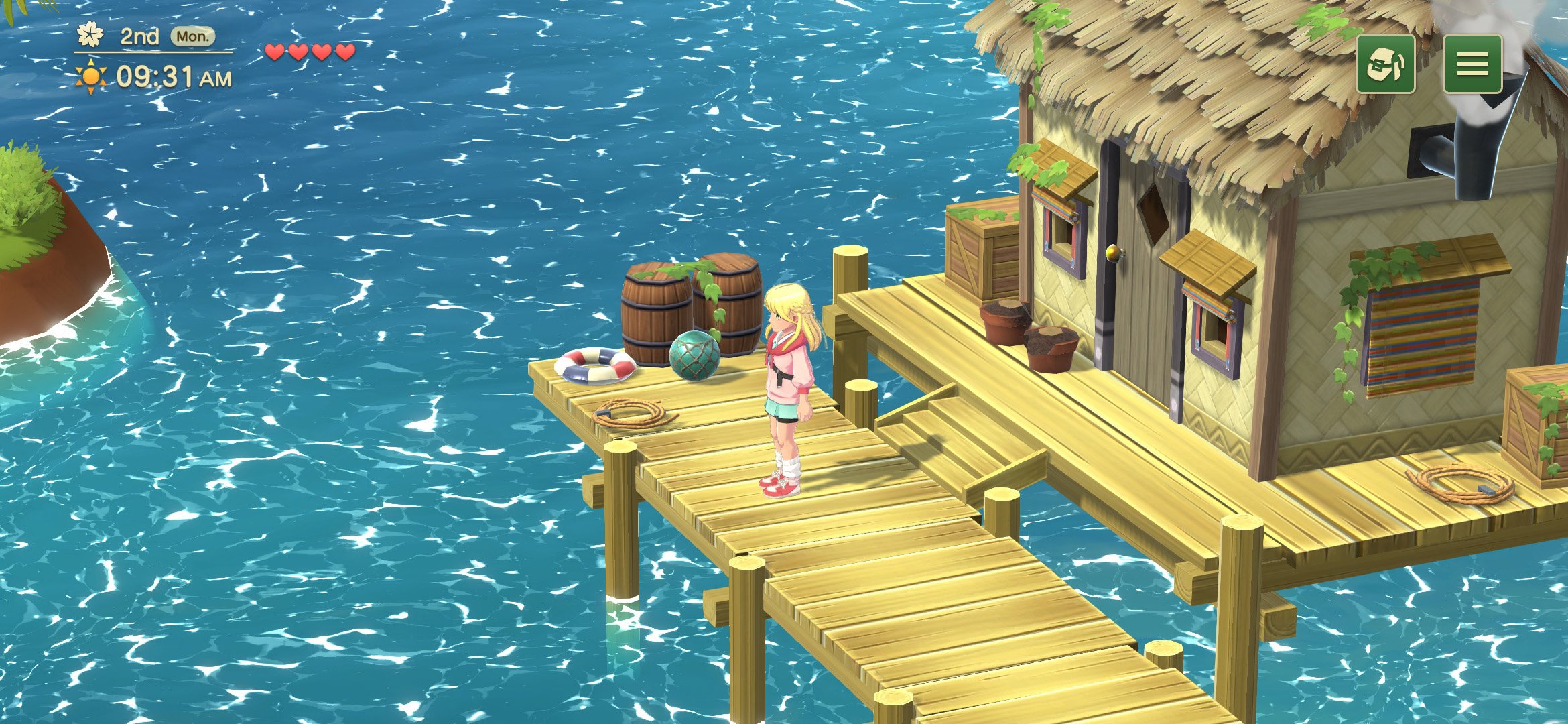
If you’re new to farming and life simulation games, Harvest Moon: Home Sweet Home takes you back from the city to a calming village where you fish, farm, interact with many NPCs, partake in festivals (that need to be unlocked), and even find a companion. The village of Alba, your new home, is dense and cozy (sorry but I had to), and I’m glad it isn’t a big open location because those usually result in a lot of empty spaces when it comes to life simulation games. If you’ve played many in the genre, think of Harvest Moon: Home Sweet Home as one that focuses more on the characters with a bit less depth when it comes to farming.

After a short tutorial explaining the basics of movement and a bit of farming, you unlock the map and main menu letting you save just about anywhere (this is very important for a mobile game), and this is where you get into the flow of Harvest Moon: Home Sweet Home where you try and finish quests for NPCs, upgrade your tools, gather, mine (this unlocks a bit later), and of course farm through the game’s main chapters.

The more I played Harvest Moon: Home Sweet Home, the more I realized that the developers understood what makes life and farming simulation games great, but fell short in some ways. These may or may not affect newcomers to the genre, but those who have played many recent games will find them lacking. The potential partners are likely the weakest aspect of Harvest Moon: Home Sweet Home. They just aren’t as interesting as other games in the genre. If you don’t care about that aspect, Harvest Moon: Home Sweet Home is quite a polished entry in the genre.

Approaching Harvest Moon: Home Sweet Home from a general life simulation game enthusiast’s perspective feels different though. While other platforms are spoiled for choice with tons of games from big and small developers, we don’t really see much like that on mobile, but that doesn’t make up for some of the flaws here, especially at a much higher price point. I think this is a very solid base that the developers can build on to the point where it would even be a great fit for PC and consoles. The only “mobile” aspect of Harvest Moon: Home Sweet Home right now is the touch control option.

Visually, aside from the performance and load times that I will cover below, Harvest Moon: Home Sweet Home looks very good. Some characters look generic, but the interface, farm, building layout, and everything looks good. I also appreciate that Harvest Moon: Home Sweet Home supports fullscreen on iPhone 15 Pro and iPad Pro. It really feels like a game properly tailored to mobile with its visuals and controls.

While Harvest Moon: Home Sweet Home does look nice visually for the most part, it is lacking when it comes to the character designs. This applies to your own character with customization options that should’ve been more detailed and also the main NPCs in the town. A lot of them feel lifeless even during cut-scenes. Barring that, I like the aesthetic a lot, and Harvest Moon: Home Sweet Home looks excellent on my iPhone and iPad. The one disappointment is in performance. Right now, Harvest Moon: Home Sweet Home is capped at 30fps on my iPhone 15 Pro and iPad Pro. I was expecting above 60fps let alone 60fps, but it isn’t possible to play at a higher frame rate now. The load times are also not as fast as they should be.

On the audio side, I was pleased with the music and sounds in Harvest Moon: Home Sweet Home. Nothing stood out to the point where I’d listen to it outside the game, but it sounded good and the music changes were appropriate to the gameplay.

When Harvest Moon: Home Sweet Home was announced as a mobile-exclusive game, I was curious how it would control. The developers have done a fantastic job with the touch controls here letting you play by tapping to move, dragging to move, and more. Interacting with objects or characters, farming, and navigating menus all feel good. Some text and touch targets feel a bit too small on iPhone, but they are fine on iPad. I would’ve loved some haptic feedback on iPhone though for using tools and even fishing. Maybe this can be added in a future update.

If you’ve played the two best life simulation games on mobile: Stardew Valley and My Time at Portia, Harvest Moon: Home Sweet Home feels closer to the former, but it isn’t as polished. I dislike bringing up other games in the same genre to compare, but I’m doing it here specifically for the mobile port. Those two games were built for PC/console and brought over to mobile while Harvest Moon: Home Sweet Home was built for mobile and yet it doesn’t feel as tailored to the platform in its features.

Harvest Moon: Home Sweet Home is a mobile-exclusive game, and while I appreciate the touch control scheme, it has a few issues right now when it comes to features. The lack of cloud saves is beyond disappointing. When I first downloaded Harvest Moon: Home Sweet Home on my iPhone, I played it for about three hours before picking up my iPad to see how it feels there. I found no way to get the save across, and still haven’t been able to move saves across devices. The lack of controller support is also disappointing for a game like this. The developers did a great job with touch controls, but it would be nice to have controller support for when I play on iPad. I would also like some quality of life features for movement, like we’ve seen in recent games in the genre.

As a newcomer to Natsume’s new Harvest Moon games but a fan of all the recent Story of Seasons and other life simulation games, Harvest Moon: Home Sweet Home ended up being worth playing, but it needs a few updates and features to be truly essential at full price. I have no issues with developers wanting to charge premium prices on mobile, but Harvest Moon: Home Sweet Home lacking basic features like cloud saves and controller support definitely makes it harder to recommend alongside a few other design issues. If the developers continue working on this, it will be one of the best in the genre on mobile, and I’m glad to see them take a chance on a premium mobile life simulation game because that is very rare.